Reaching a global audience is crucial for the success of any online store. One effective way to expand your reach is by making your eCommerce store multilingual.
According to the Bright Plugins website, providing content in multiple languages can increase online sales by up to 100%. By offering various language options, you can increase shopping experience. In this guide, we will explore how to build a multilingual WooCommerce store with a language switcher and offer tips to WooCommerce language switchers to facilitate language switching.
What are the options to change the WooCommerce language?
As explained above, providing multiple languages on a website significantly enhances accessibility for non-English-speaking customers, thus opening up new markets and increasing sales potential.
Furthermore, in changing the WooCommerce language, there are several options available. Firstly, you can change the language within the WooCommerce dashboard. This alters the language of the administrative interface, making it easier to manage the store in your chosen language.
Additionally, you can change the language of the store itself, which modifies the language of the website content, including product descriptions and checkout pages.
Moreover, you can add a language switcher directly to your website by installing the multilingual plugin WooCommerce. Here is a detailed explanation of these three options.
Change WooCommerce dashboard language
You can change the language in the WooCommerce dashboard. This configuration is beneficial if your store administrator needs to be fluent in English.
For example, you can display store content in English to reach global customers but use the admin interface in Spanish so your Spanish-speaking staff can easily manage the store backend.
First, log in to your WordPress dashboard, then open the menu Settings > General > Site language.
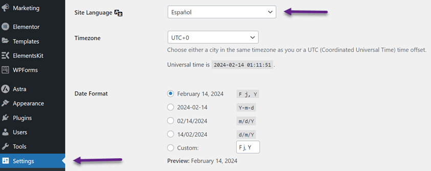
Then click Save Changes, and the dashboard display will change to Spanish.

The method above will change the language on the back-end dashboard but not the front page of your WooCommerce store. Therefore, we will change the shop’s language.
Change language store
The second option is to change the language on the store’s front page. The method is still the same, namely changing the language via General > Settings > Site Language. Then, you also need to update the translations regularly to keep your store updated using the Update Translations button.
On the WordPress dashboard, select Dashboard > Updates > Update Translations.
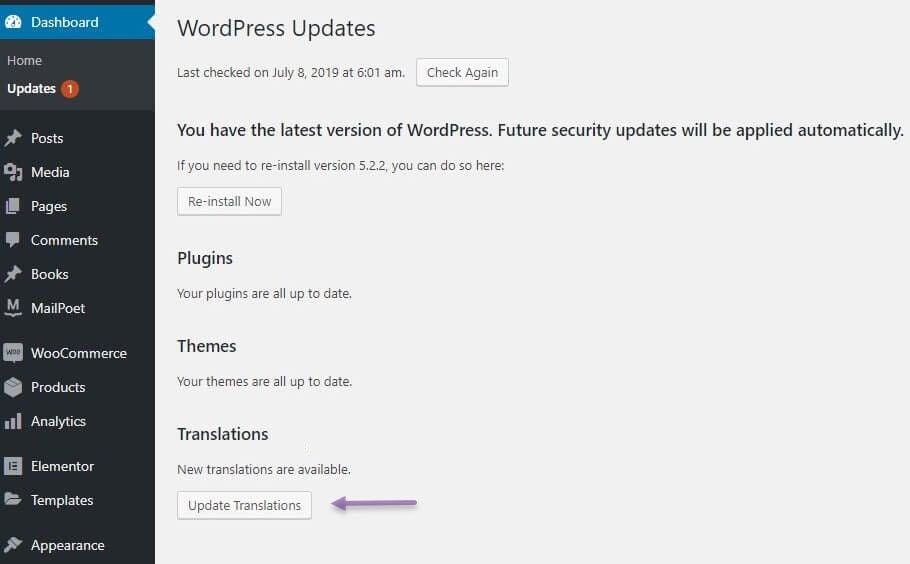
After that, your shop front page will be replaced using the language you previously selected.
Using a language switcher on your multilingual store
Changing the language using the method above is quite complicated because you have to change one person via the dashboard. Therefore, the third option for changing the shop language is to use the language switch button on a multilingual shop.
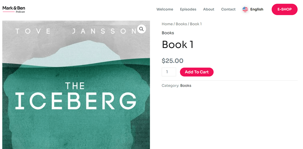
The language switch button lets users switch between different languages on a website or app. This user interface element allows users to select a language they understand.
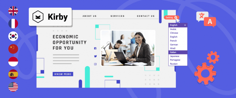
With the language switch button, you can provide various languages for users. The following is an example of how to use the language switch button.
The reasons your website should provide a language switcher
Before discussing tips for the WooCommerce language switcher on a multilingual store, it’s essential to understand why your website needs to support a language switcher. Here are some reasons:
- Facilitating language selection: Users can choose their preferred language with a language switcher button. This ensures they can easily understand the content or products in your store.
- Providing a better user experience: Language switchers help visitors better understand your website’s content and create a more positive overall user experience. By being able to switch between languages they are proficient in, visitors feel more comfortable and confident navigating your site.
- Expanding market reach: When your website is available in multiple languages, every visitor can choose their preferred language, ensuring that your message can be easily understood by anyone, regardless of their language background. This way, you can expand your market reach and attract interest from a broader audience segment.
- Increasing sales conversion: Users who interact with the website in their language will better understand product information and promotions. This can increase their trust in your brand and motivate them to purchase, ultimately boosting sales conversion.
- Facilitating access to information: Visitors can access important information on your site without language barriers. With a language switcher, users can easily navigate and understand site content, ensuring the information they seek is readily available and accessible.
- Improving customer retention: Users who feel well accommodated with content in their language are more likely to remain loyal and revisit your site. This helps improve customer retention and build long-term relationships with your audience.
With these various benefits, there is no doubt that providing a language switcher feature is a crucial step in enhancing the quality and accessibility of your website and improving relationships with visitors from around the world.
Start building a multilingual store for better WooCommerce language switchers
Now that you understand the importance of a language switcher on a website, making your site multilingual is essential.
Creating a multilingual site can be done using automatic translation services like Linguise. Linguise automatic translation is integrated with WooCommerce and capable of translating all pages such as:
- All product pages
- All blog posts pages
- Checkout and cart pages
- Payments pages
- Testimonial pages, and much more
Additionally, it also allows for the presence of a language switcher on multilingual stores. This feature lets users easily switch between their preferred languages, enhancing their comfort and experience.
To integrate Linguise with your WooCommerce store, ensure you have an active WordPress site with various products you intend to market.
Here are the steps to building a multilingual eCommerce store using Linguise.
Step 1: Add domain and languages
The first step is registering for a free Linguise account and registering a WooCommerce store domain. In register account, you only need to enter your email and password.
After that, select the WordPress platform and enter the domain you want to register.
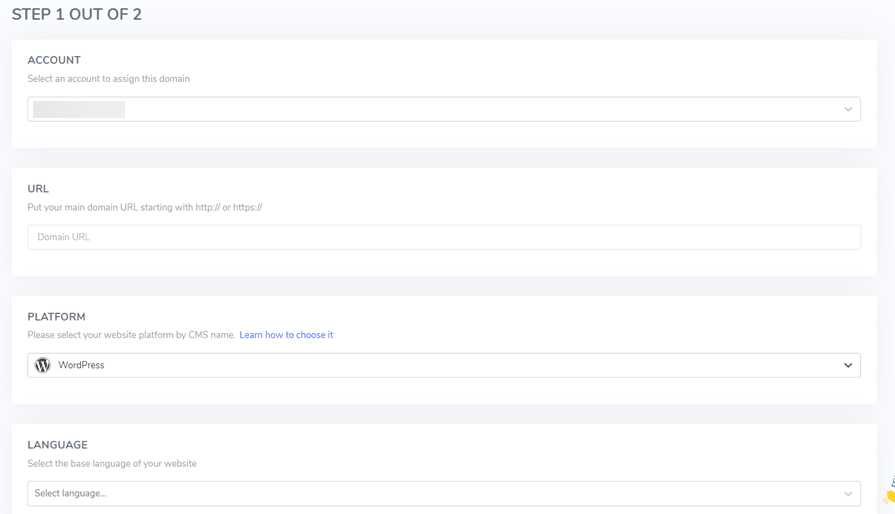
Next, you can add whatever languages you want displayed in the language switcher.

If all the columns have been filled in, you will get an API key, which you must paste into WordPress.

Step 2: Add Linguise to your WooCommerce store
The next step is to add Linguise to your WooCommerce store. Here, you have to add the Linguise plugin to WP. To do this, open the WordPress dashboard > Plugins > search for Linguise > Install > Activate.
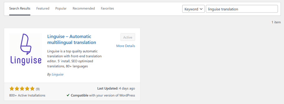
If Linguise has been installed, open the Linguise menu, then in the column, paste the API key you have obtained.

Step 3: Translate your multilingual store
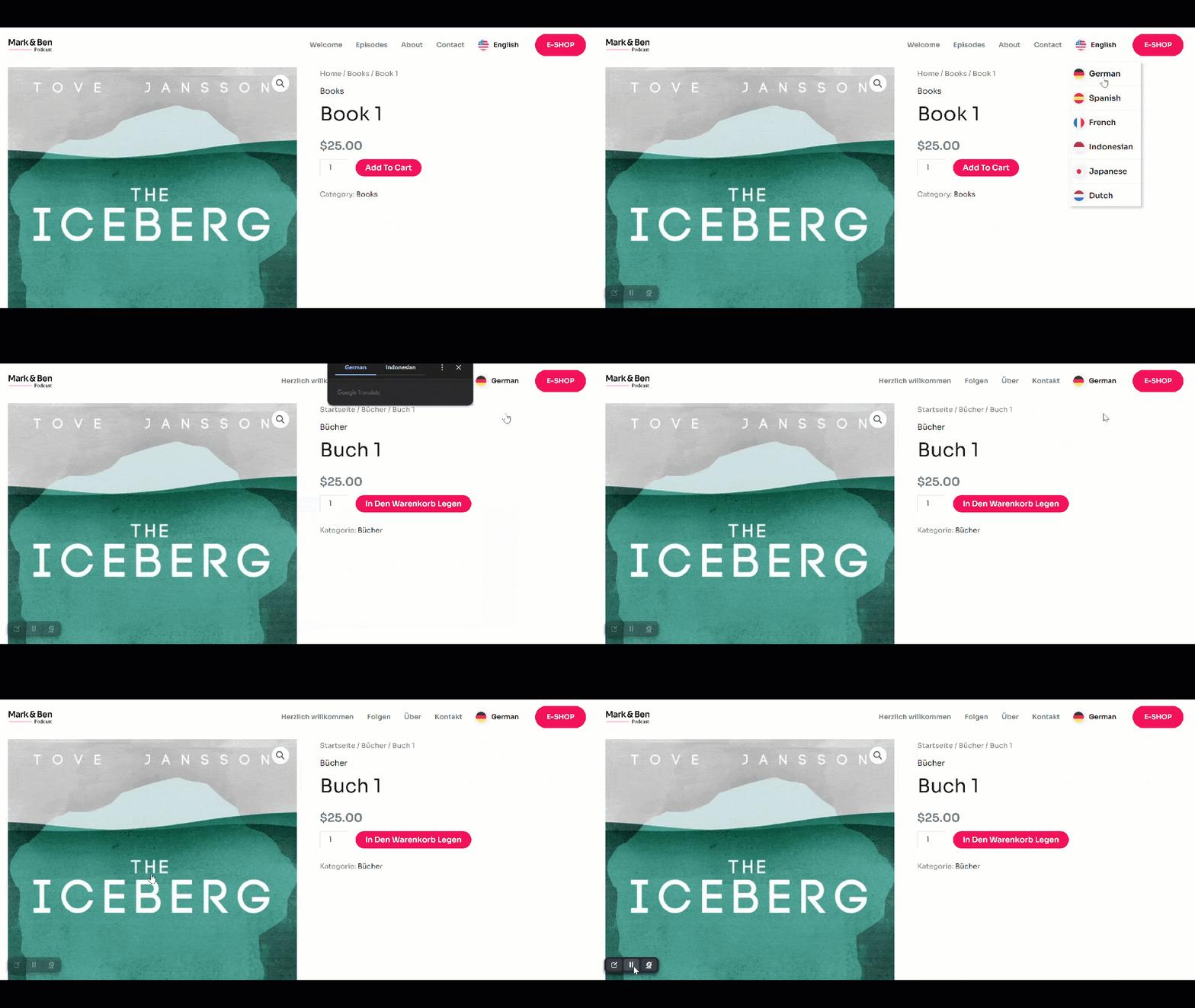
After WooCommerce is connected to Linguise, your shop page will automatically have a language switch. However, this display is still the default, but don’t worry because Linguise allows you to customize it.
Here’s an example of what a WooCommerce multilingual store looks like with a language switcher.
Tips for WooCommerce language switcher
After knowing how to build a multilingual WooCommerce store, we will discuss the tips for creating a WooCommerce language switcher to provide users with comfort.
Use the drop-down menu
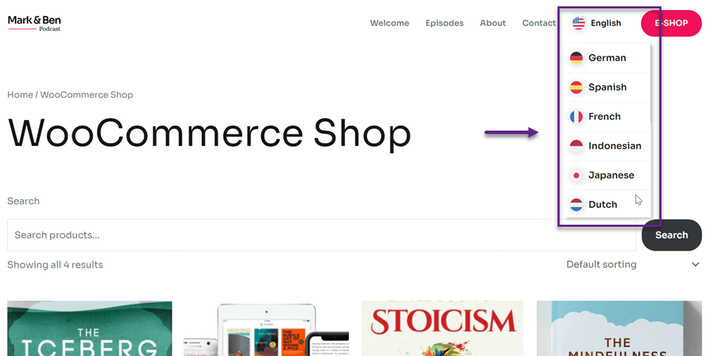
Using a dropdown menu to display language options is one effective way to address cluttered displays and ensure that the website’s layout remains organized and easy to navigate.
When you have many language options to present to users, placing all language buttons or flags directly on the website layout can make the display too cluttered and confusing. Using a dropdown menu, you can store all language options in one box, thus saving space on your website pages.
Also, you maintain a clean and tidy website appearance by hiding language options within the dropdown menu. This allows the main focus to remain on the content and primary elements of the site without being disrupted by numerous language buttons scattered throughout the pages.
Finally, you can customize the dropdown menu’s layout, color, and design style to align with your site’s aesthetics and branding. This enables you to create a language switcher that is functional and visually appealing.
Place strategically
Placing the language switcher strategically on your website is crucial to ensure users easily find and access it. Typically, the language switcher is positioned in each page’s top right or top left corner. This position is easily visible and accessible to users when they first land on the web page.
If your site has a horizontal navigation menu at the top, add the language switcher next to the right of the navigation menu to keep it close and easily accessible.
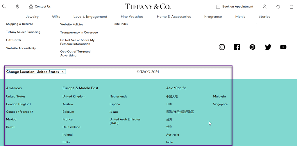
On the homepage, the language switcher can be placed in the bottom right corner to remain visible even as users scroll down. Also, make sure to maintain the language switcher’s location consistent on all pages. Avoid hiding the language switcher in a drop-down menu so users don’t overlook it. By placing the language switcher in a strategic position, you ensure that this feature is easily found and used by visitors to your website.
The following is an example of placing the language switcher in the lower left corner.
Use symbols or flags
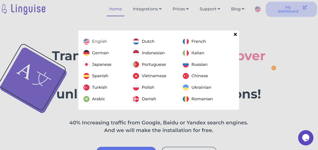
Flag icons make it easier for users to identify languages because the flag symbol is universally recognized. Users don’t need to be able to read the language names in text to determine their desired option. This greatly assists users with limited digital literacy skills.
Secondly, the use of national flags creates an intuitive and user-friendly experience. Users can instantly know which language options correspond to their country or geographic region without guessing.
Furthermore, flag symbols enhance the visual appeal of the language switcher interface.
Lastly, national flags expedite the language selection because users can only read through some of the text options to find the language they’re looking for. This saves time and increases user satisfaction.
Using flag symbols is one of the best tips for the WooCommerce language switcher to maximize its functionality in displaying language options on your website’s language switcher.
Provide clear language names
Make sure the list of available languages is straightforward to understand. Avoid using language codes that are unfamiliar or ambiguous. Instead, use commonly used or familiar language names for users.
When adding a language switcher in WooCommerce, it’s essential to ensure that the label or indicator for each language is displayed clearly. This will make it easier for customers to recognize and select the desired language.
For example, use the full name of the language, such as “Indonesian” instead of just “ID”. This is easier to understand. Use bold or different fonts to highlight language labels. This makes them easier to see.
Examples of clear use of country names or languages can also be seen in the example above.
Provide consistent choices
You should ensure consistency not only in translations but also in the placement of the language switcher on all pages of the multilingual store. Consistent placement makes it easier for users to find the button.
Furthermore, ensure that the number of available languages remains the same on all pages.
Perform A/B testing
You can test various language switcher designs to see which is most effective in capturing users’ attention and encouraging them to use the feature. This includes testing different button styles, sizes, colors, and other visual styles.
Additionally, you can test the location and placement of the language switcher in various parts of your website, such as in the header, footer, sidebar, or even within the content. A/B testing helps you find the most effective location to increase user engagement and use of the language switcher.
You can also use A/B testing to evaluate the effectiveness of different languages in the language switcher. For example, displaying the most commonly used languages is more effective than displaying the entire list of available languages. Through A/B testing, you can better understand user preferences and behaviours related to the language switcher.
Customize the WooCommerce language switcher
After understanding various tips that need to be implemented when creating a WooCommerce language switcher, you can then customize or set up the language switcher to fit your store’s needs better.
If you’ve already successfully created a multilingual store, Linguise has a language flags display feature to customize those buttons.
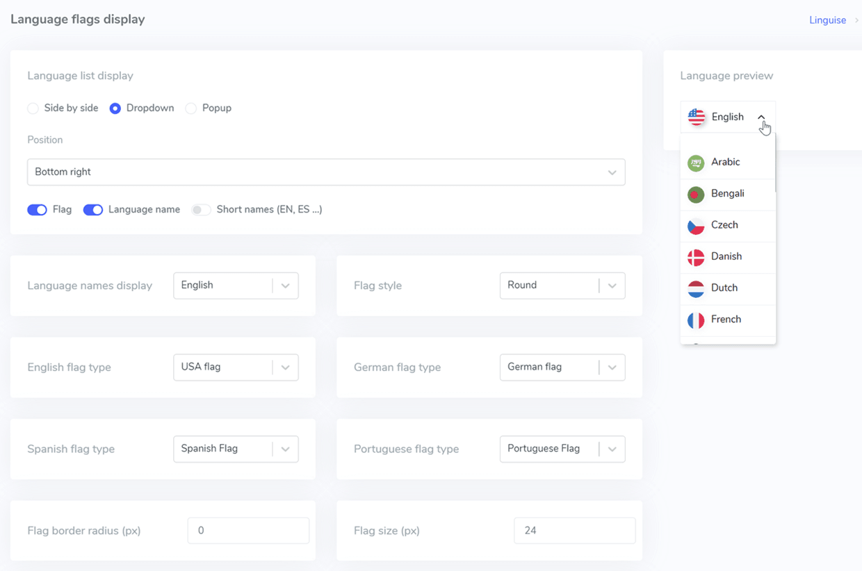
This can be done through either the WordPress dashboard or the Linguise dashboard. Now, open the Linguise dashboard > Settings > Language flags display.
Next, you will see a display like the widget below. On this page, you will find:
- Language flags display
- Position
- Language names display
- Flag style
- English, German, Spanish, Portuguese, Taiwanese style
- Flag border
- Flag size
- Language name color and language name hover
- Flag box shadow and flag box shadow on hover
Then, on the right side, there is a preview of the language switcher you are creating.
Create language switcher for switching languages easier!
Now that you know the tips for WooCommerce language switchers and how to build a multilingual WooCommerce store, it’s time to reach a wider audience by creating a multilingual store with a practical language switcher.
Automatic translation services like Linguise can be a solution for creating language switchers quickly and easily.
You must sign up for a Linguise account, integrate the plugin with WooCommerce, and customize the language switcher according to your needs.
In creating language switchers and automatic translations, Linguise directly adds hreflang codes. This can improve the multilingual SEO performance of your website because hreflang codes can inform search engines about the relationship between equivalent pages in different languages.
By automatically adding hreflang codes, Linguise helps ensure that search engines like Google understand that each language version of your website is an equivalent alternative, not duplicate content.
Thus, using Linguise facilitates WooCommerce language switchers but also helps improve your website’s search engine optimization.
So, what are you waiting for? Sign up for a Linguise account now and enjoy a free trial for one month, then add your WooCommerce store domain immediately.

