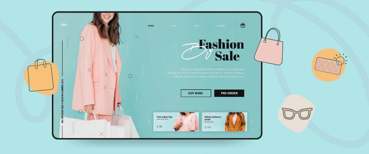
Tired of the same old-fashioned website? A good fashion website design is like a virtual runway. Every detail, from the layout to the font selection, must be perfect to showcase your best collections.
That’s why we’re bringing you fashion website design inspiration that will make your brand shine. It’s time for some new inspiration! We’ve gathered dozens of the best fashion website designs to help you create a unique and attractive online presence. Let’s find your favorite!
Keypoints: Top fashion website design
Visual-first, minimalist layouts
Most of the showcased websites use large, high-quality images, minimal text, and spacious layouts. This approach keeps the focus on the products and creates a premium, editorial feel that matches fashion branding.
Strong brand identity through design
Many of the designs rely on distinctive fonts, bold headlines, and carefully chosen color palettes to express the brand’s personality. This helps each site feel unique while guiding visitors’ attention to key collections or campaigns.
Smooth and intuitive shopping experience
The examples emphasize simple navigation, clear categories, and interactive elements like hover effects or animations. These features make browsing feel effortless and help users move naturally from inspiration to purchase.
The reason multi-language on fashion website matters

The fashion business is no longer limited to the domestic market. The opportunity to reach the international market is huge. However, to be successful in the global market, a fashion website must be able to communicate with a diverse audience, including non-English speakers. Here are some reasons why fashion websites should support multi-language.
- Reach a broader market: Providing a website in multiple languages opens up opportunities to reach consumers from different countries. This will increase the number of website visitors and potential sales. The global fashion market is huge and growing.
- Improves user experience: When visitors can access the website in their own language, they will feel more comfortable and easily understand the information presented. This will improve the user experience and make them more likely to shop. It shows that you value customers from different cultural backgrounds.
- Improves SEO: Each language has different keywords for fashion products. By optimizing your website for multiple languages, you can target more keywords and increase your website’s visibility on search engines. Search engines like Google can detect users’ language and display relevant search results.
Top 25 fashion website design for Inspiration
For those of you looking for website fashion inspiration, here are some options you can choose from. Let’s discuss them one by one.
1. Cos
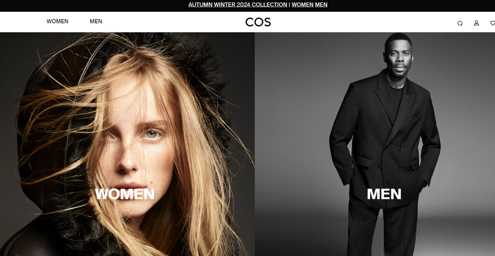
COS is a fashion brand known for its minimalist designs. Their products range from everyday wear for both women and men. The design of the COS website is very minimalistic, with a neutral color palette and clean typography. Its simple layout makes it easy for visitors to focus on the products.
The main navigation menu is at the top of the page, with clear and structured product categories. The website footer is also very informative, providing quick access to information such as sizing, shipping, and return policy.
COS multi-language feature:
COS is a fashion brand known for its minimalist designs. Their products range from everyday wear for both women and men. The design of the COS website is very minimalistic, with a neutral color palette and clean typography. Its simple layout makes it easy for visitors to focus on the products.
The main navigation menu is at the top of the page, with clear and structured product categories. The website footer is also very informative, providing quick access to information such as sizing, shipping, and return policy.
2. Sandy Liang
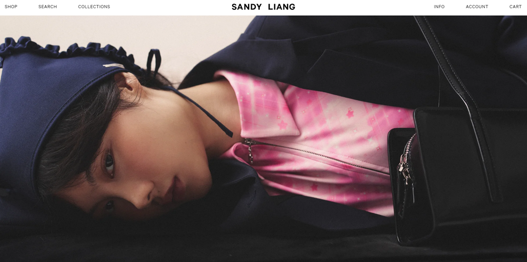
Sandy Liang is website sells various unique and stylish fashion products, including clothes, shoes, bags, jewelry, and accessories. The brand is known for its 90s-inspired designs with a modern and feminine twist.
When visiting Sandy Liang’s website, the first thing that strikes one is the ever-changing full-width header image—these photos are generally taken with a live flash technique. The main navigation menu is at the top of the page, clearly presenting the product categories.
Sandy Liang multi-language feature:
The website also supports multilingual features by providing a language switch button in the footer and listing the currencies.
3. Ganni
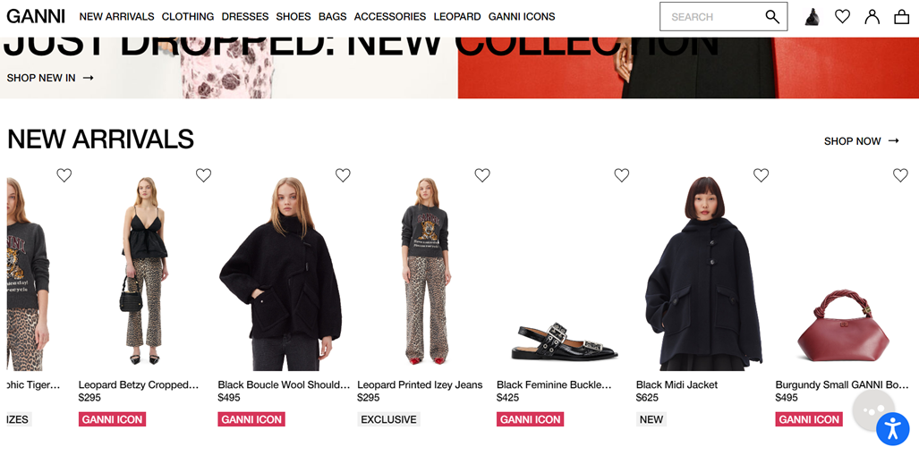
The GANNI website showcases a fashion brand selling clothing and accessories. The product range includes new arrivals, dresses, shoes, bags, and items featuring leopard prints. The site highlights a “Just Dropped” new collection and displays various clothing pieces like jackets, jeans, and shoes in the featured “New Arrivals” section. While no explicit multi-language option is visible, the presence of a global brand suggests potential localization capabilities, though this isn’t immediately apparent from the screenshot.
Ganni multi-language feature:
Gianni’s website offers language and currency switching. This feature is in the footer, where you can switch languages and select the currency you need.
4. KHY
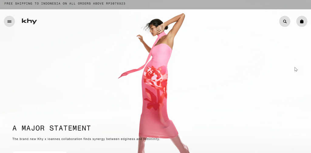
The Khy website primarily sells fashion items, and this is the Kylie Jenner brand. The site focuses on bold, statement fashion pieces that make an impact. The navigation is simplified, featuring only a hamburger menu icon, the brand logo, and search and cart icons. The main content area is dominated by a large, eye-catching image that serves as the focal point.
Multi-language feature KHY:
The language and currency change feature can be found in the footer. There are various languages to choose from, ranging from Albania to Zimbabwe, and they are all complete with currencies. In addition, when you first log in, the website will automatically detect where you are located.
5. Lisa Says Gah
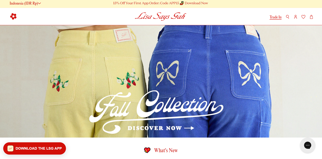
Lisa Says Gah appears to be selling clothing, mainly showcasing a Fall Collection. The image displays two pairs of colorful corduroy pants with embroidered details, focusing on quirky, unique fashion items. The playful and nostalgic design has a retro-inspired logo and pastel color scheme. Navigation elements include a settings icon, search, user account, wishlist, and shopping cart.
Lisa Says Gah multi-language feature:
A language switcher in the top left corner confirms the website’s multilingual capabilities. This allows users to easily change their preferred language and adjust pricing to their local currency. This indicates the site caters to an international audience and likely offers localized versions for different markets.
6. Sezane
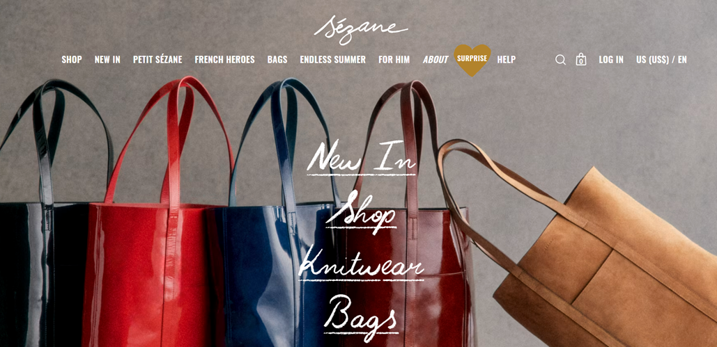
Sézane is a fashion brand selling clothing, bags, and accessories. The homepage prominently features leather tote bags in various colors, highlighting their “New In” collection. The clean and sophisticated design has a white logo against a neutral background. The navigation menu is comprehensive, featuring categories like “SHOP”, “NEW IN”, “PETIT SÉZANE”, etc. The layout combines high-quality product photography with handwritten-style text overlays, creating an elegant and inviting aesthetic.
Sezane multi-language feature:
The top right corner displays a language and currency switcher labelled “US (US$) / EN” for multilanguage functionality. This feature allows users to select their preferred country and language, making the site accessible to an international audience.
7. Blandin & Delloye
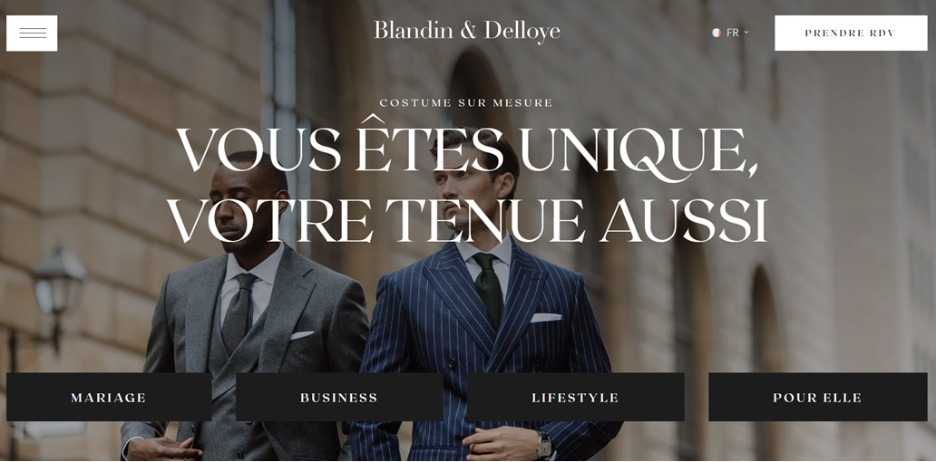
Blandin & Delloye specializes in custom-made suits, emphasizing uniqueness and personalized style. The website caters to various occasions and clientele, offering categories like MARIAGE (wedding), BUSINESS, LIFESTYLE, and POUR ELLE (for her). This range suggests they provide tailored formal wear for men and women across different aspects of life. Four distinct category buttons are displayed at the bottom, allowing easy navigation to specific suit types.
Blandin & Delloye multi-language feature:
Regarding multilanguage functionality, the top right corner features a language switcher with “FR” displayed, indicating French as the current language. This suggests the ability to switch between French and English, catering to an international clientele.
8. Me + Em
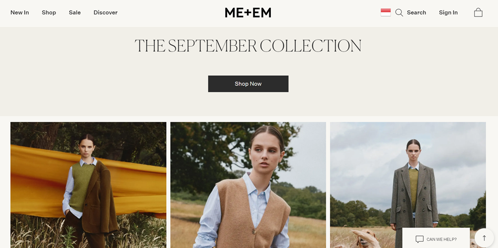
ME+EM is a fashion brand. The homepage features high-quality images of women’s clothing, including knitwear, blazers, and shirts in autumnal colors like mustard yellow, camel, and olive green. The photography highlights the brand’s sophisticated, tailored style for a mature, fashion-conscious audience. The website has a clean, minimalist design with a white background and elegant typography. The top navigation bar includes categories making it easy for users to browse different sections.
Me+Em multi-language feature:
The top right corner has a flag icon next to the search and sign-in options. This flag button likely allows users to change the language, shipping destination, and currency.
9. Farm Rio
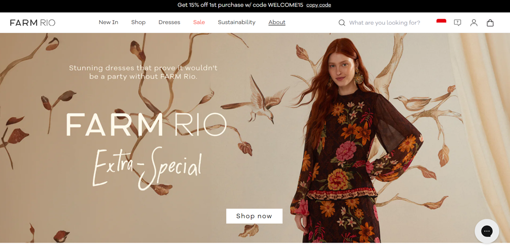
Farm Rio is an online fashion retailer specializing in vibrant, floral-patterned dresses and clothing. Their style appears to blend bohemian and tropical influences, creating unique and colorful garments. The website’s design is elegant and user-friendly. The hero section features a large, attractive product image alongside the brand name and a “Shop now” call-to-action button. The background incorporates artistic leaf motifs that complement the dress’s design, creating a cohesive visual theme.
Farm Rio multi-language feature:
In the upper right corner, there’s a language switcher represented by a flag icon. This feature allows users to change the website’s language and likely the country for shipping and currency purposes. It’s positioned alongside the search bar, user account, and shopping cart icons, making it easily accessible.
10. Dior
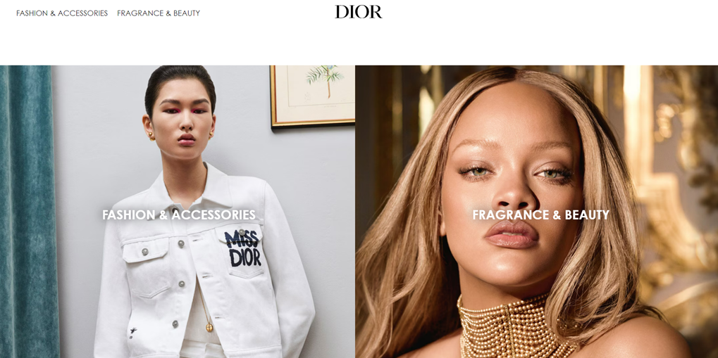
Dior’s website showcases its luxury fashion and beauty offerings. The website’s design exudes elegance and sophistication, reflecting Dior’s brand identity. High-quality, striking imagery dominates the homepage, instantly capturing visitors’ attention. The clean, minimalist layout with ample white space emphasizes the luxury aspect of the brand. This design approach allows the products to take center stage while maintaining a user-friendly interface that guides visitors smoothly through the site.
Dior multi-language feature:
Dior includes language options in the website footer. This feature allows users to select their preferred language and country, customizing their browsing experience.
11. Maison Labiche
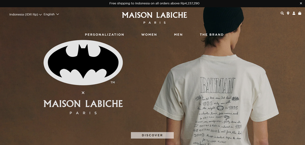
Maison Labiche is a Parisian fashion brand. The website features personalized clothing with a focus on embroidered items. The main product is a white T-shirt with Batman-themed handwritten text on the back, indicating a blend of high-end fashion and pop culture elements. The website’s sleek and minimalist design reflects a high-end fashion aesthetic. The navigation menu is simple and clear, featuring categories. Then, the brown background adds warmth and sophistication to the overall design, contrasting nicely with the white T-shirt displayed.
Maison Labiche multi-language feature:
In the top left corner are dropdown menus for language and currency selection. The current settings show “Indonesia (IDR RP)” and “English,” indicating that the site caters to an international audience. This feature allows users to browse in their preferred language and see prices in their local currency, enhancing the shopping experience for a global customer base.
12. Idioma
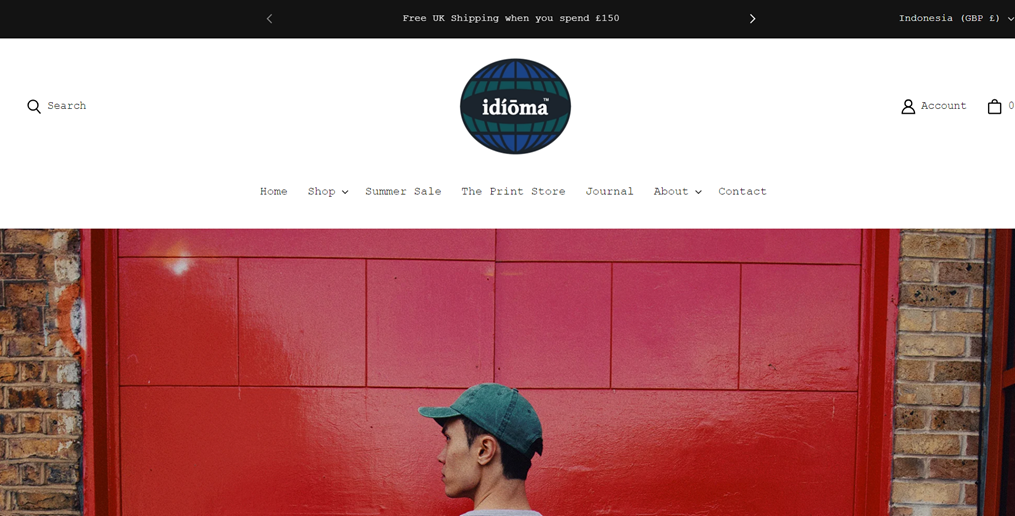
This website appears to be for Idioma, a fashion brand or retailer. Based on the navigation menu, they likely sell clothing and accessories, with sections for “Shop,” “Summer Sale,” and “The Print Store.” The main navigation is clearly laid out, with dropdown menus for Shop and About sections. The search bar, account login, and shopping cart are conveniently placed in the top corners for easy access. Overall, the layout is intuitive and adheres to standard e-commerce design practices, making it easy for users to browse and shop.
Idioma multi-language feature:
A dropdown menu in the top right corner represents the multilanguage and multi-currency feature. It allows users to select their country, which likely adjusts the language and currency. The dropdown mentions a range from Afghanistan to Zimbabwe, indicating a wide international reach. A
13. Sleeper
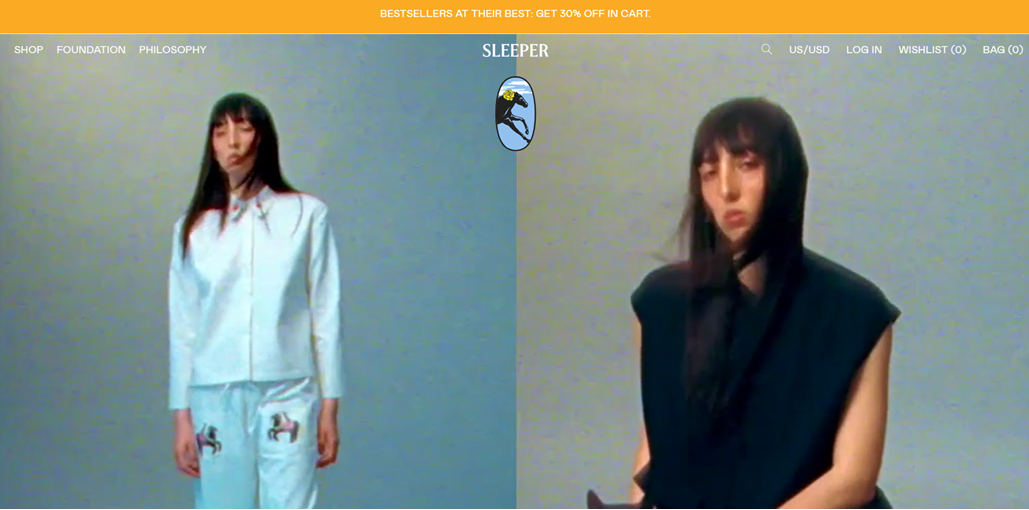
Sleeper sells clothing, likely focusing on sleepwear and loungewear. The brand offers a range of styles from comfortable home wear to potentially more fashionable pieces. The website has a clean, minimalist design with a white background. he brand logo “SLEEPER” is prominently displayed in the center. On the right side of the header, there are icons for search, login, wishlist, and shopping bag. The main content area features large, high-quality images of models wearing the brand’s clothing.
Sleeper sells clothing, likely focusing on sleepwear and loungewear. The brand offers a range of styles from comfortable home wear to potentially more fashionable pieces. The website has a clean, minimalist design with a white background. he brand logo “SLEEPER” is prominently displayed in the center. On the right side of the header, there are icons for search, login, wishlist, and shopping bag. The main content area features large, high-quality images of models wearing the brand’s clothing.
Sleeper multi-language feature:
The top right corner has a “US/USD” button, indicating multilanguage and multi-currency support. This feature allows users to select their country and preferred currency, tailoring the shopping experience to their location.
The top right corner has a “US/USD” button, indicating multilanguage and multi-currency support. This feature allows users to select their country and preferred currency, tailoring the shopping experience to their location.
14. Olive Clothing
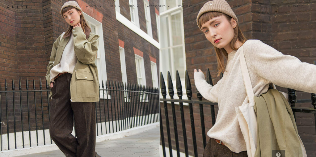
This website sells fashion clothing and accessories. The focus is on women’s fall/winter clothing, as shown in the picture. The clothing styles are casual yet elegant, combining classic elements with a modern twist. The design of the site looks clean and user-friendly. However, the main navigation menu at the top is not very visible because the font is too thin, which may make it difficult for first-time customers. However, the minimalist layout of this website with a white background helps to highlight the products. The responsive design allows for smooth navigation on various devices.
Olive multi-language feature:
The footer features a multi-currency feature that allows customers to view prices in their preferred currency, such as Euros, Canadian Dollars, Australian Dollars, and more. This feature enhances the shopping experience for international customers and reflects the brand’s global market focus.
15. Rouvenat
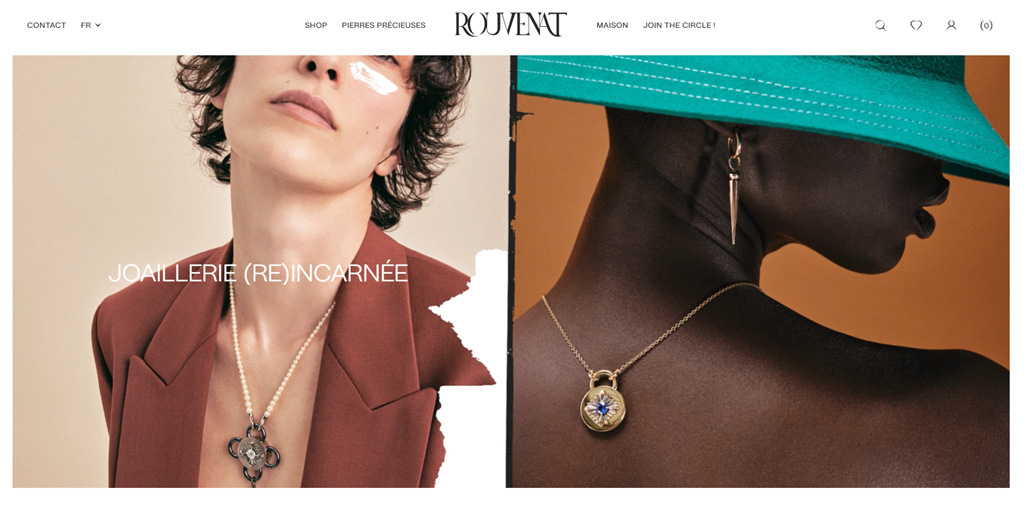
Rouvenat appears to be a high-end jewelry brand. The website showcases elegant necklaces with intricate pendants, suggesting a focus on luxurious and possibly vintage-inspired jewelry designs. The images highlight the jewelry models wear, emphasizing the brand’s attention to detail and artistic vision. The website’s sleek and user-friendly design has a clean layout that focuses on the jewelry. They use of high-quality, artistic photographs creates a luxurious atmosphere.
Rouvenat multi-language feature:
A language toggle in the top left corner allows users to switch between French (FR) and English. This feature enhances accessibility for a global customer base and reflects the brand’s international presence.
16. Mango
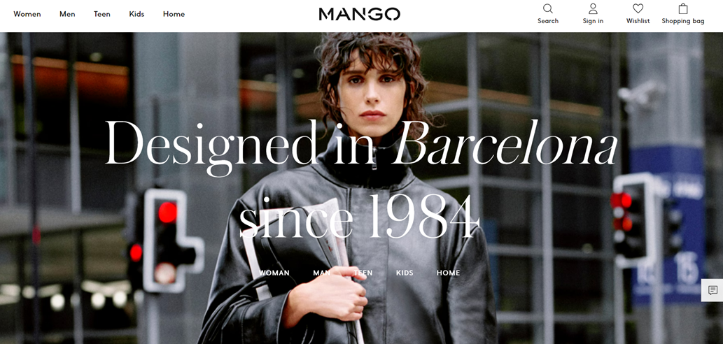
Mango is a fashion retailer offering a wide range of clothing and accessories. The website caters to multiple demographics, including women, men, teens, kids, and even home goods designed in Barcelona since 1984. The website design is clean, modern, and user-friendly. The top navigation bar categorizes products into Women, Men, Teen, Kids, and Home sections, making it easy for users to find what they’re looking for. The search, sign-in, wishlist, and shopping bag icons are conveniently placed in the top right corner.
Mango multi-language feature:
In the center footer, there are a country/region selector with dozens of options. This feature significantly enhances the site’s global accessibility, allowing users from various countries to view the site in their preferred language and see region-specific pricing and availability.
17. Flannels
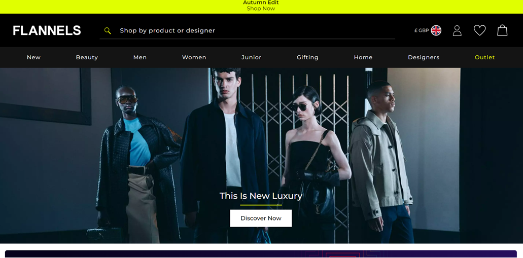
Flannels is a luxury fashion retailer offering a wide range of high-end clothing and accessories. The main image showcases stylish, contemporary outfits on diverse models, emphasizing the “New Luxury” concept. This indicates Flannels focuses on premium, designer fashion brands across various categories. The top navigation bar is well-organized and features clear categories.
Flannels multi-language feature:
In the top right corner, there’s a language and currency selector, indicated by “£GBP” and a UK flag icon. This feature allows users to choose their preferred country and currency, tailoring the shopping experience to their location.
18. Everlane
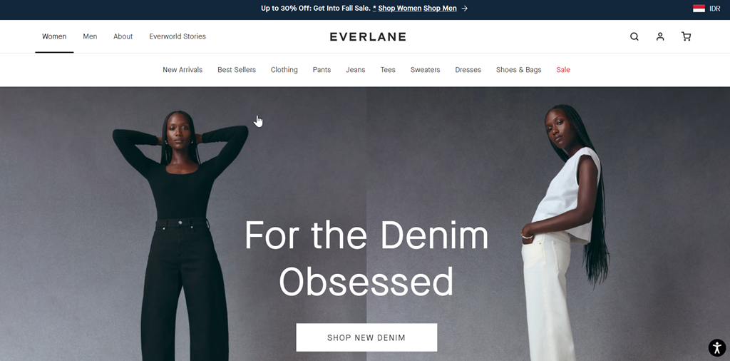
Everlane is a fashion retailer specializing in contemporary clothing for men and women. The homepage prominently features denim products, with the “SHOP NEW DENIM” call-to-action button. The top navigation bar also indicates a wide range of products, including clothing, pants, jeans, tees, sweaters, dresses, and shoes and bags. The layout features a dual-level navigation system. The top bar includes broader categories (Women, Men, About, Everlane Stories) while a secondary menu offers more specific product categories.
Everlane multi-language feature:
In the top right corner, a language and currency selector is indicated by a flag icon (this image shows the Indonesian flag “IDR”). This feature allows users to select their preferred country, automatically adjusting the site’s language and currency.
19. Valentino
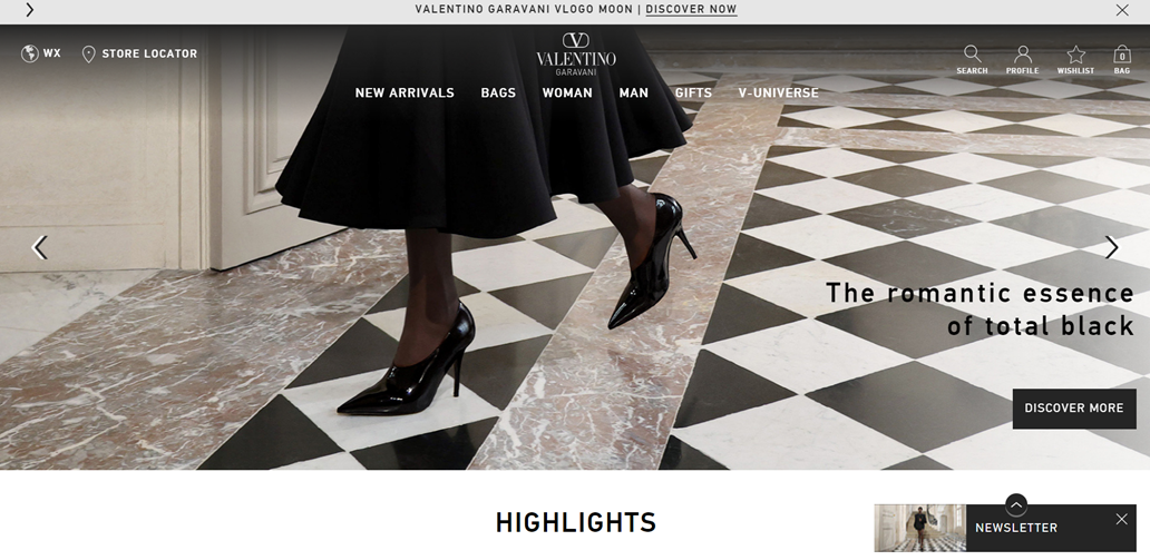
The Valentino website showcases a high-end fashion brand that primarily sells luxury clothing, bags, and accessories for women and men. The design is sleek and user-friendly, with a clean, minimalist aesthetic that aligns well with the brand’s luxury positioning. The checkerboard floor in the main image adds visual interest while maintaining the monochromatic theme.
Valentino multi-language feature:
The website offers region selection options. In the top left corner, there’s a “WX” button, likely standing for “World” or “Worldwide,” which allows users to choose their continent and then select a specific country.
20. Tiffany & Co
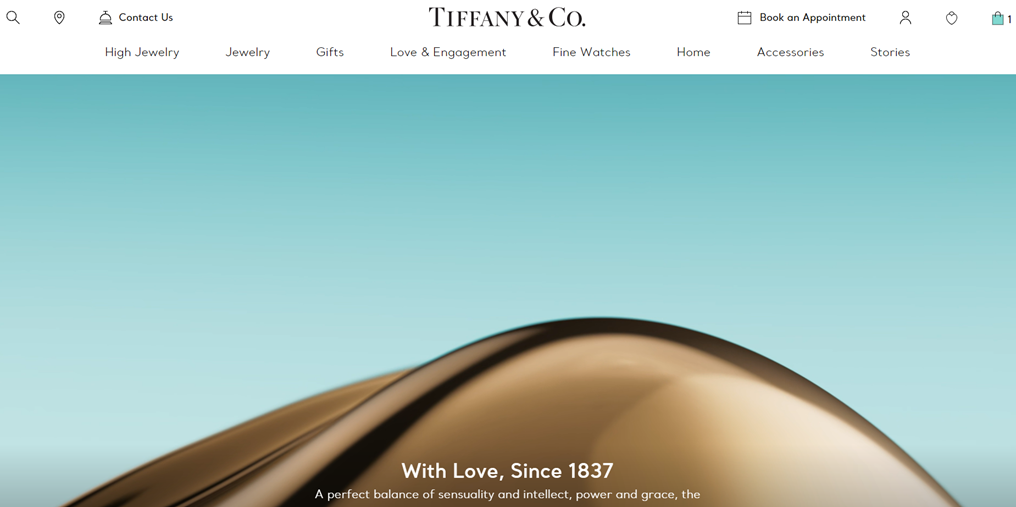
Tiffany & Co.’s website showcases its luxury jewelry and accessories. The product range includes high jewelry, everyday jewelry, gifts, engagement rings, fine watches, home decor items, and accessories. The website design is clean, user-friendly, and reflects the brand’s signature aesthetic. The navigation is straightforward, with clearly labeled categories across the top. User-friendly features include a search function, store locator, contact information, and options to book appointments or view the shopping bag.
Tiffany & Co multi-language feature:
This website has selectors in the footer, allowing users to choose their region (Europe, Asia, Americas) and, subsequently their preferred language and local currency. This localization ensures a tailored shopping experience for customers worldwide, reflecting Tiffany’s status as an international luxury brand.
21. Carolina Herrera
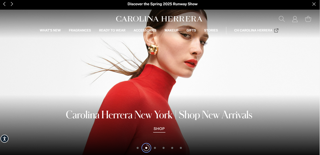
The Carolina Herrera website showcases a luxury fashion and beauty brand, offering various products, including fragrances, ready-to-wear clothing, accessories, makeup, and gifts. The website design is sleek and user-friendly, with a clean white background that allows the vibrant product images to stand out. The carousel-style main image with navigation dots at the bottom allows for easily browsing featured content. The overall design is minimalist yet sophisticated, aligning well with the brand’s luxury positioning.
Carolina Herrera multi-language feature:
For Carolina Herrera, this feature is likely accessible through a regional/language button in the website footer, allowing users to select their country and preferred language. This localization feature ensures the site can serve an international clientele, adapting currency, product availability, and language to suit different markets worldwide.
22. Bouguessa
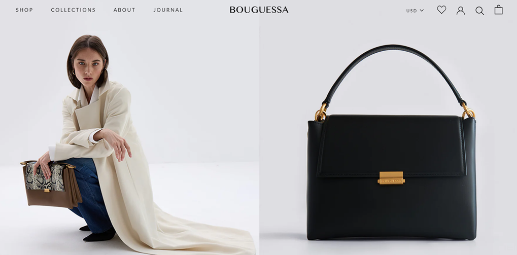
Bouguessa is a luxury ready-to-wear fashion brand that sells high-end clothing and accessories. The website showcases elegant, sophisticated designs that blend classic and contemporary styles. The navigation menu at the top is simple and intuitive, with clear categories like “SHOP,” “COLLECTIONS,” “ABOUT,” and “JOURNAL.” The right side of the header features easily accessible icons for currency selection, wishlist, user account, search, and shopping bag.
Bouguessa multi-language feature:
The website offers a currency selector in the top right navigation bar. Users can choose USD, Euro, AED, and GBP, indicating that the site caters to an international audience. This feature suggests that the website offers language options for customers from different regions.
23. Net-A-Porter
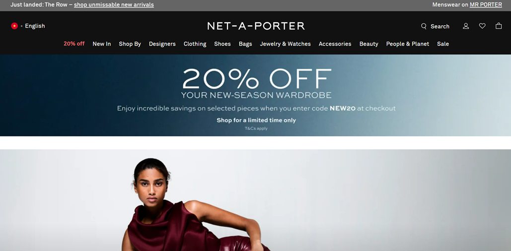
NET-A-PORTER is a luxury e-commerce platform offering a wide range of high-end fashion items. The website sells designer clothing, shoes, bags, jewelry, watches, accessories, and beauty products. It caters to both women’s and men’s fashion, as indicated by the “Menswear on MR PORTER” link at the top. The website design is clean, sophisticated, and user-friendly. The navigation menu is comprehensive yet well-organized, featuring categories and. The overall design balances providing ample information and maintaining a clutter-free, elegant aesthetic.
NET-A-PORTER multi-language feature:
The website offers language options in the top left corner. Users can switch between English and Mandarin, catering to a global audience focusing on English-speaking and Chinese markets.
24. Madina Visconti
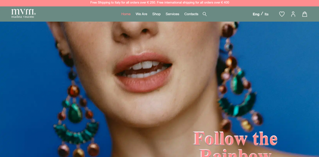
This website is for Madina Visconti, a jewelry designer and brand. The site showcases and sells Madina’s nature-inspired jewelry collections. The main navigation is simple and user-friendly, with clearly labeled sections for “Home”, “We Are”, “Shop”, “Services” and “Contacts”. Icons for language selection, favourites, account, and shopping cart are conveniently placed in the top right.
Madina Visconti multi-language feature:
The site offers multilanguage functionality, with an “Eng / Ita” toggle in the top navigation, allowing users to switch between English and Italian versions. This feature enhances accessibility for both international and local Italian customers, expanding the brand’s reach.
25. Rino-Pelle
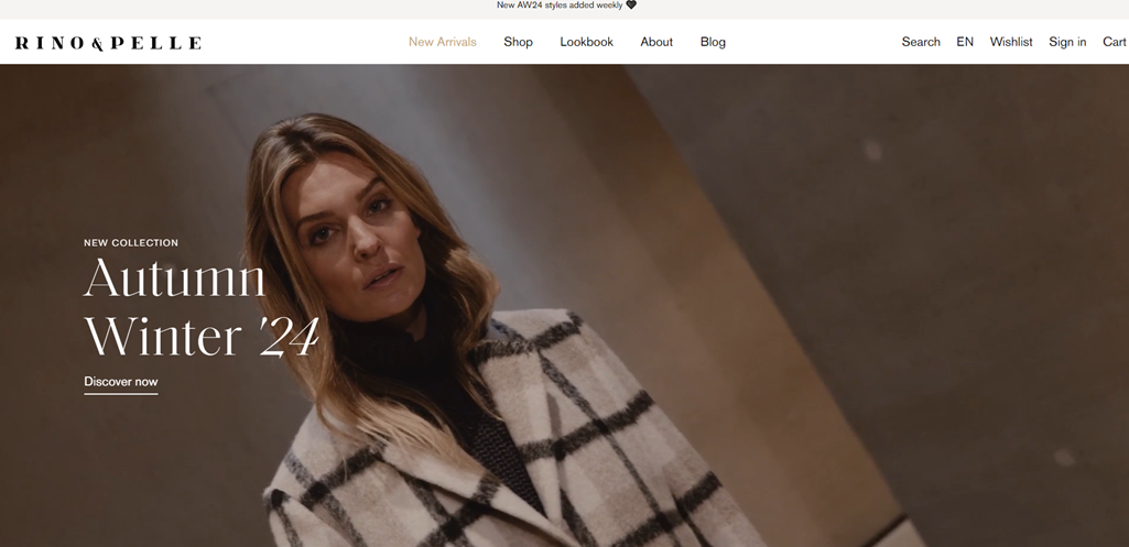
This website is for Rino & Pelle, a fashion brand selling luxury women’s clothing and accessories. The clean and user-friendly design has a simple white background and minimalist black text, allowing the product imagery to stand out. The main navigation menu is laid out at the top, featuring sections. Additional user-centric features like Search, Wishlist, Sign In, and Cart are conveniently placed in the top right corner.
Rino & Pelle multi-language feature:
The website offers multilanguage functionality, with a language selector in the top right corner. Users can choose between English (EN), German (Deutsch), and Dutch (Nederlands), catering to an international audience. This feature enhances accessibility for customers across different regions, potentially expanding the brand’s market reach. The prominent placement of the language toggle makes it easy for visitors to find and use, improving the overall user experience for a diverse customer base.
Conclusion
Fashion website design is crucial in showcasing brands and products to a global audience. The examples we’ve explored demonstrate how top fashion brands utilize clean layouts, stunning imagery, and user-friendly navigation to create engaging online experiences.
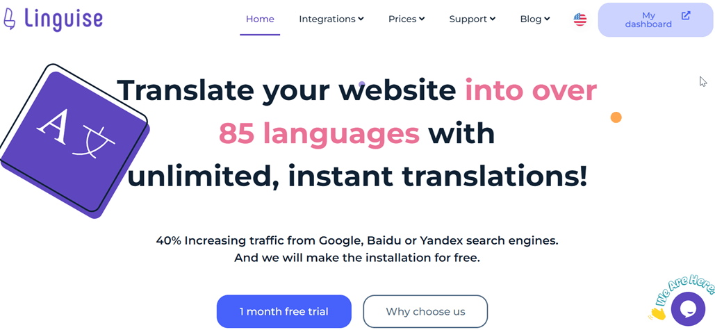
Implementing a robust multilanguage feature is essential for fashion brands looking to expand their reach internationally. While many showcased websites offer built-in language and currency options, brands seeking a comprehensive solution might consider tools like Linguise’s automatic translation website. By combining inspiring fashion website design with effective multilanguage capabilities, brands can create visually stunning and globally accessible online platforms that appeal to fashion enthusiasts across different cultures and markets.

