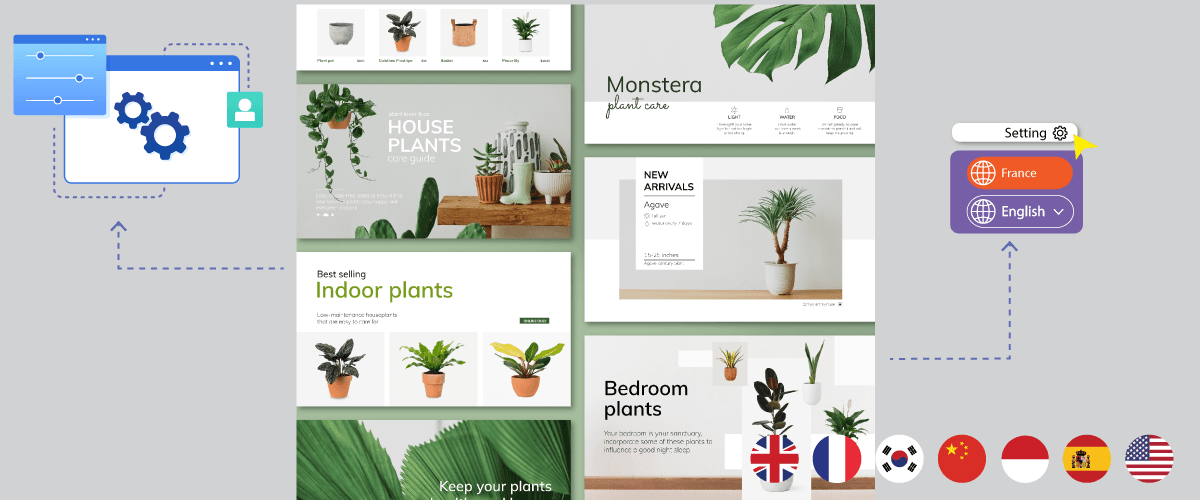
Having a multilingual site not only focuses on the content being translated into various languages but also localizes the design and layout of the website to suit the culture of the target language.
According to the OneSky App article, 52% of the sites in the world speak English, but only 25% of them can reach all users on the internet. Therefore, localization has the potential to increase user reach.
In this article, we will discuss what website localization is and how to localize the design and layout in several steps. Keep reading this article until the end!
Why does website design and layout need to be adapted?
Before entering the step of localizing the design and layout, make sure you know the reasons why the design must be adapted to the language of the destination country.
Here are some reasons designs and layouts should be adapted and localized.
- Respect cultural diversity: every region has a cultural diversity with preferences for colors and symbols. By adapting the design, the website respects and embraces this diversity, providing an experience closer to local values.
- Adaptation to specific languages and scripts: localization involves adapting to specific languages and scripts local communities use. Customizing the layout and design ensures text and visual content are easy to understand and comply with local language norms.
- Compliance with local technical requirements: technical aspects such as date format and currency need to be adjusted to comply with local standards. This increases user convenience and makes the website more functionally relevant.
- Provides continuity with the brand: localized design supports continuity with the brand identity. By including visual elements or messages that are more related to local culture, websites maintain brand integrity while adapting to the local context.
- Increased engagement levels: designs that take local preferences into account can increase engagement levels. This creates a closer relationship between the website and the user, increasing user retention and satisfaction.
- Overcoming multi-language challenges: font choices, navigation, and other design elements can help overcome the challenges of providing multi-language content. Localized design effectively responds to this complexity.
- SEO benefits and global competitiveness: localized design can improve SEO performance in local markets and increase global competitiveness. Websites that adapt well to local preferences are more likely to rank high in search engines and attract more visitors.
7 Steps to localize the design and layout of a website
After knowing why you have to localize your website design and layout, we will discuss several steps you have to take to localize your site, including the following.
Keep the design consistency
The first step in localizing a website is to ensure that the design and layout of the website remain consistent even if it is accessed from different languages. This not only ensures that it includes visual elements but also that it makes things easier for users and provides clarity in navigation.
By maintaining design consistency, the website becomes the primary channel for communicating differentiating elements and brand identity. Consistent colors, typography, and other design elements help create a strong, memorable brand image.
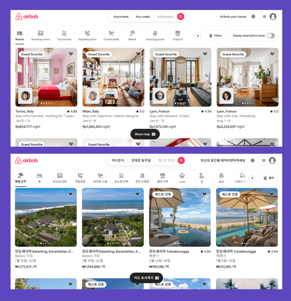
An example of implementing web design consistency can be seen in the image below. The first image is when you access the Airbnb site using English, while the second image accesses using Korean.
As can be seen below, the layout, navigation, button locations, and icons are still the same as before.
Use appropriate colors
Color selection is one step in web design localization because there are differences in color interpretation in several countries. For example, if you are in parts of the United States, you might see yellow as a bright and fun color.
However, in Indian culture, yellow tends to be considered a symbol of good luck rather than just a pleasant color.
Even so, it remains to be seen whether the local color still matches the brand identity color. Usually, small changes to a brand’s color palette can be very striking.
Make it easy to switch languages
The next step is to make sure the retain language button is easy for users to find and easy to use.
Place the language preservation button in a prominent location, such as at the top or bottom of the page, and ensure consistent placement across all site translation pages. This helps users easily find the option to switch languages.
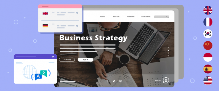
On the language switcher, use icons or symbols that visually represent language preservation. This can be a flag symbol, a globe icon, or the name of the language. The right iconography can provide powerful visual clues.
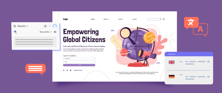
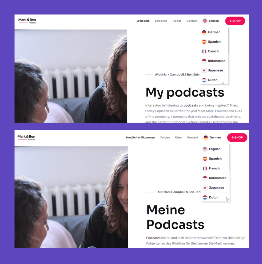
For example, in the following image, there is a language switch button that uses a flag icon and the name of the country in the top right corner.
When the site is accessed in English or German, the button remains at the top right.
Adapting right-to-left (RTL) language
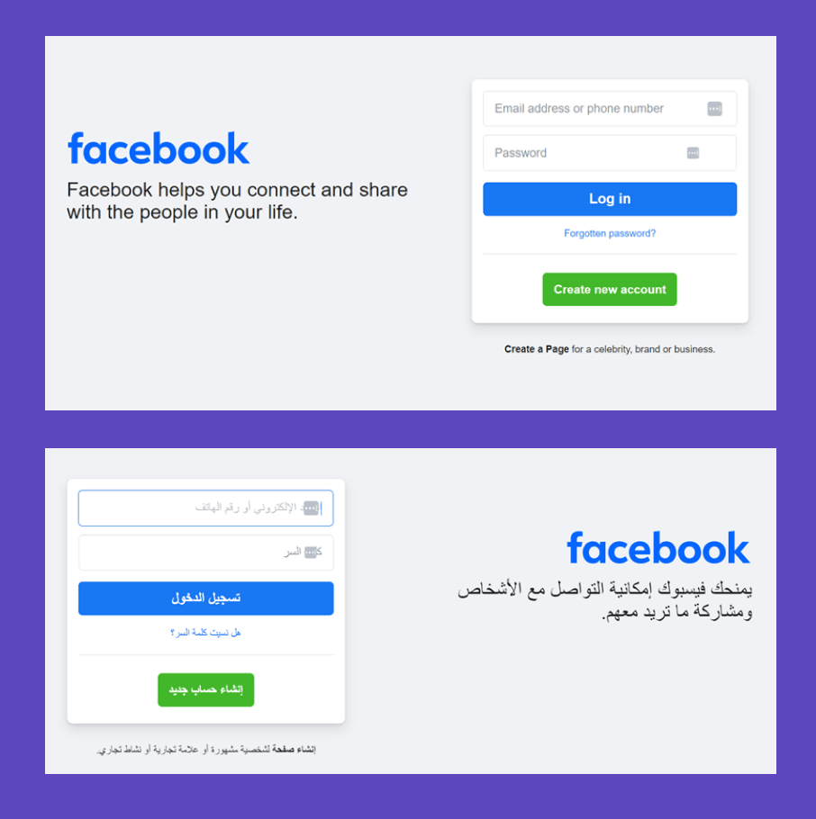
Adapting the language layout from right to left is one of localize the design. For those of you who target users who use languages such as Arabic, Hebrew, etc., the site needs to accommodate the writing direction from right to left. Other elements like navigation, buttons, and others should be reversed.
As in the example below on the Facebook site. In the image below, there are Facebook websites for English and Arabic. You can see that writing content in Arabic is done from the right; this adapts to the procedure for writing Arabic.
Use culturally appropriate images
Use images that are appropriate and relevant to the local culture of each target market. This helps build local user trust.
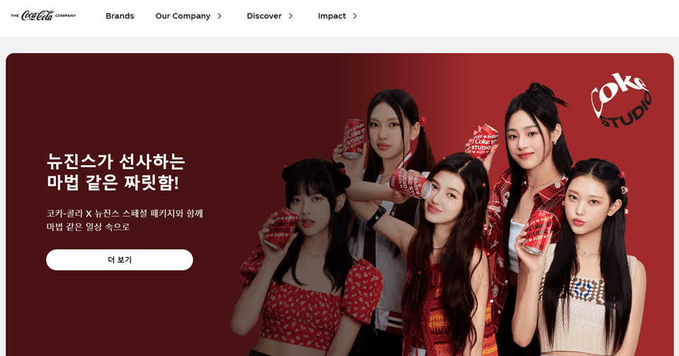
The following example still comes from the Coca-Cola website, which does provide a complete target language. This time, it comes from Korea.
In this localization, he uses images that show the country of Korea, namely one of the popular girl bands from Korea.
Customize date, currency, and phone number formats
When you are in the process of localizing your website design and layout, it is important to ensure that dates and other technical formats match local preferences. Because this will affect the visuals of the website.
For example, the date format in Indonesia is DD/MM/YYYY, while in America it is MM/DD/YYYY.
Not only the date but the currency format must also be adjusted to the language of the country being used at that time.
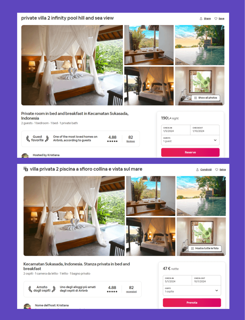
One example of the application of technical localization you can see on the Airbnb website which provides various currency options.
As on the following page, there are differences when translated into Arabic and Italian. Not only is the content translated, but there are currency adjustments as well.
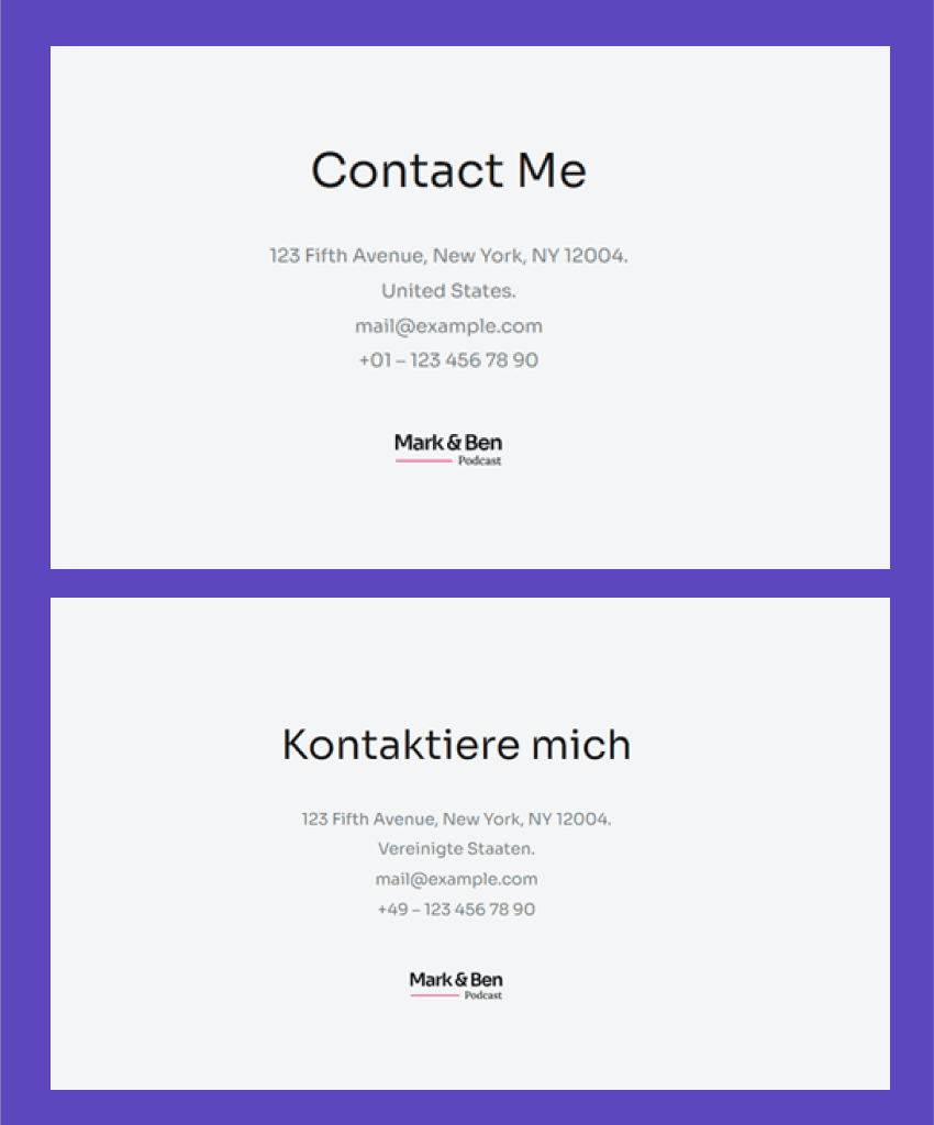
Next, which is no less important, is the telephone number format. Each country certainly has its telephone number format. To localize your website, you can create a different telephone number code for each existing language.
For example, in the following image, there are differences in telephone number codes when translated into English and German.
Use fonts that are compatible with all languages
Lastly, make sure you use fonts that are compatible with all the languages you choose.
If all the languages you display use the Latin alphabet, there will likely be no problems. However, when including a language with a Cyrillic alphabet or one that operates from right to left (RTL) on your site, not all fonts support that type of alphabet.
So some adjustments are needed. The start is to add support for RTL languages in your CSS code. This can cause font changes when visitors switch from a left-to-right (LTR) language to a right-to-left (RTL) language.
A good recommendation is to use a collection of fonts, not just one font for the entire website. By using font sets, you can make substitutions if the first font is not suitable for a particular language.
Localize the design and layout with Linguise
After knowing the step-by-step, this time we will try to localize the design and layout using Linguise.
Linguise is a translation service that can automatically translate content into more than 85 languages you can choose from. Apart from that, Linguise is also supported by many features that help with website localization. So how do you localize website design and layout? Here are the steps.
Step 1: Automatic content detection
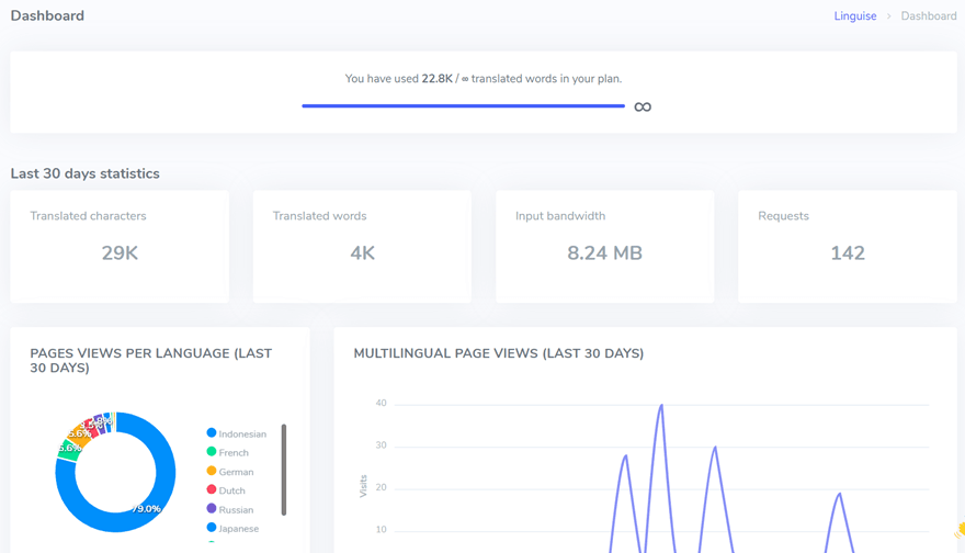
Linguise drives the localization process by offering automatic content detection. In this step, the platform scans your website, identifying text and elements that require translation.
This automated process helps save time and ensures a comprehensive overview of all content to be localized.
Step 2: Create a language switcher
One step to localize the design and layout is to make the language switch button easy to find and consistent in all language translations.
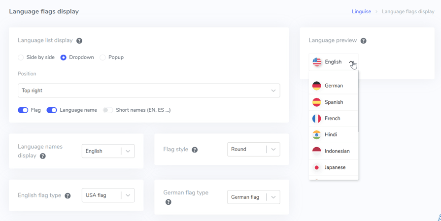
Linguise allows you to customize the language switcher according to your needs. To customize, you can go through the Linguise dashboard > Settings > Language flags display.
In the following display, you can adjust the icon shape such as side by side, popup, or dropdown.
Then, you can also choose the position of the language switch button that will be displayed on the website. For complete steps, you can read setup language switcher from dashboard.
Step 3: Edit localized content using a live editor
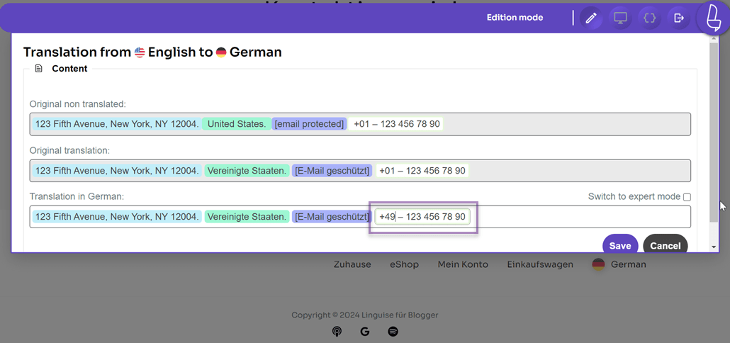
If the content has been translated automatically, you can edit the translation if something is not appropriate using the live editor feature. This feature can be used to localize the content contained in the design.
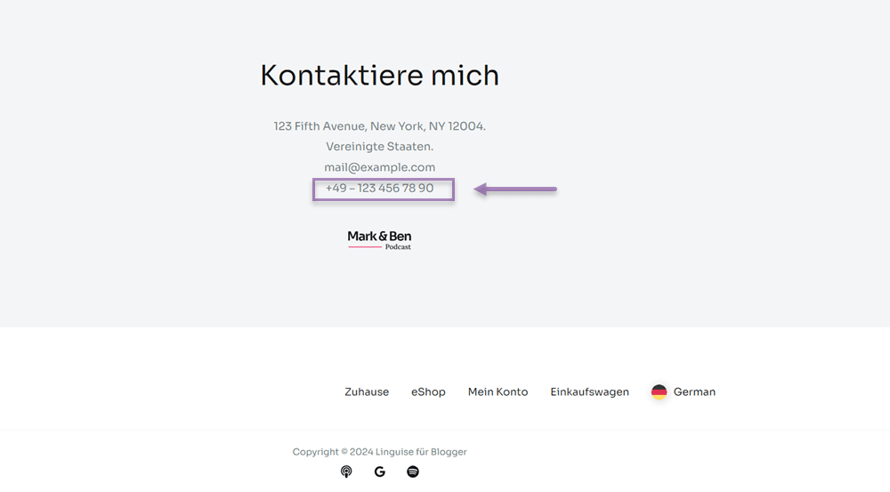
For example, we want to change the phone number code from the previous +01 to +49 in the address section because we are translating to German.
If so, then select Save to save the changes. With the live editor, users can directly localize the site by selecting it on the front page of the web.
This is the result of localization that has been carried out in the live editor, namely changing the country telephone number code.
Step 4: Exclude content using translation rules
Localization can not only be done through the live editor by editing the translation directly. To maximize localization, you can take advantage of the translation rules feature, which is to activate translation.
With the translate translation feature, you can localize content that you don’t want to be translated and leave it as original. For example, delivering translations by URL, by line, or by page.
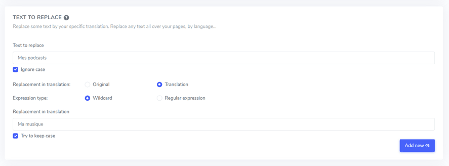
You can find this feature in the Linguise dashboard > Rules. As in the following image, this is an example of using Translation Rules text to replace.
Here we will replace the words “Mes podcasts” with “Ma musique” which will be applied every time it is translated into French.
Step 5: Localize the website with the help of a translator
Finally, you can also localize your website with the help of a translator. Linguise allows you to add and setup translators to the site you want to localize.
How to add it is quite easy, go to the Linguise dashboard > Members > Invite a new member.
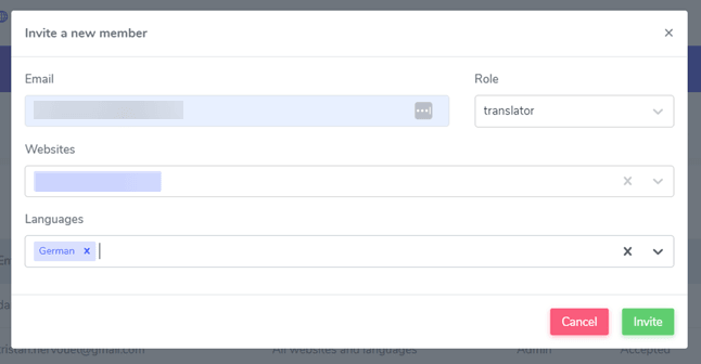
The add new member feature allows you to localize your website with a more professional translator. So that localization results can be more in line with the cultural preferences of each target country.
Conclusion
That is an explanation of how to localize the design and layout of a website. In this article, you will also understand better what localizing a website is, the difference with translation, and the benefits of localizing a website.
After understanding the importance of website localization, now is the time for you to localize your site to reach a wider audience.
With Linguise, you can localize website design and layout with the help of various excellent features such as translation rules, a live editor, and even the ability to add translators.
Register a Linguise account for free for 1 month, and localize the site by translating up to 600 thousand words!

