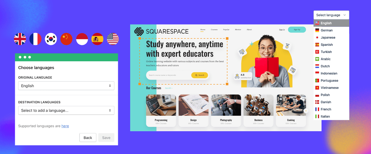
When creating a multilingual website, attention to language switch elements is important. Users frequently visit this section when they want to switch languages.
The same goes for you as a Squarespace multilingual site owner. Therefore, it is crucial to create a language switcher for Squarespace that is friendly, easily accessible, and user-friendly.
This article will discuss how to design a language switcher for Squarespace, complete with design tips and reasons why you should do it.
Why is the language button important for the multilingual website Squarespace?
Before discussing how to design your Squarespace language button, you also need to understand why the language button is important for a multilingual Squarespace website.
- Serving a global audience: A multilingual website is crucial for businesses looking to expand their reach beyond national borders. Language buttons allow you to present content in the preferred languages of your target audience, making your website accessible and appealing to a global market segment.
- Enhancing user experience and engagement: Language barriers can significantly hinder user experience, leading to confusion and increased bounce rates. Well-designed and adequately implemented language buttons streamline switching between language versions, ensuring a smooth and user-friendly experience. By providing content in visitors’ preferred languages, you can increase engagement and improve time spent on the site.
- Improving accessibility and inclusivity: This simple yet powerful feature can make your website more welcoming and inclusive, promoting a sense of ownership for visitors who may not be proficient in the primary language. It also helps comply with accessibility guidelines and regulations, which often emphasize providing content in multiple languages.
- Enhancing SEO and online visibility: Translating your website into multiple languages can improve your search engine rankings and visibility in various regions or markets. Language buttons help search engines understand the language variations of your site, ensuring that relevant content is served to users based on their language preferences.
- Reinforcing brand identity and building trust: Well-designed language buttons that align with your brand’s visual identity and tone can strengthen your brand image. By addressing the linguistic needs of your audience, you demonstrate a commitment to providing a personalized and culturally sensitive experience, which can build trust and loyalty. Attention to these details can set you apart from competitors.
- Facilitating content management and localization: With Squarespace’s multilingual feature, language buttons simplify managing and organizing content across different language versions. This allows for easy navigation between language variations, streamlining content management and localization processes. It can save time and resources, as you can efficiently maintain and update your multilingual content from a centralized platform.
By including wisely designed language buttons on your Squarespace website, you not only cater to the needs of a multilingual audience but also demonstrate a commitment to providing an outstanding user experience, fostering inclusivity, and positioning your brand as a global competitor in your industry.
Where should I place the Squarespace language button?
Before discussing further how to design a Squarespace language button, it is important to understand the position of the language button so that it is easy for users to reach.
Below are several recommended positions and examples of relevant websites using the language button position.
Header
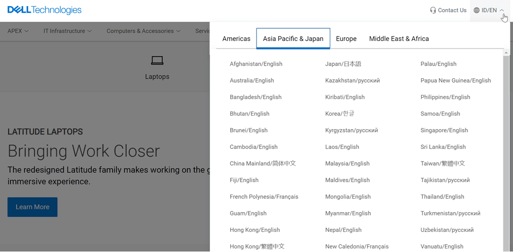
Placing the language button in the header area is the most recommended option. The header is the first element visitors see when browsing a website.
By having the language button in this area, the visibility and accessibility level from any page within the site become very high. This placement also aligns with standard web design practices, where users expect to find important functions for the entire site, such as language selection, in the header.
One example of a language button in the header comes from Dell’s official website.
Footer
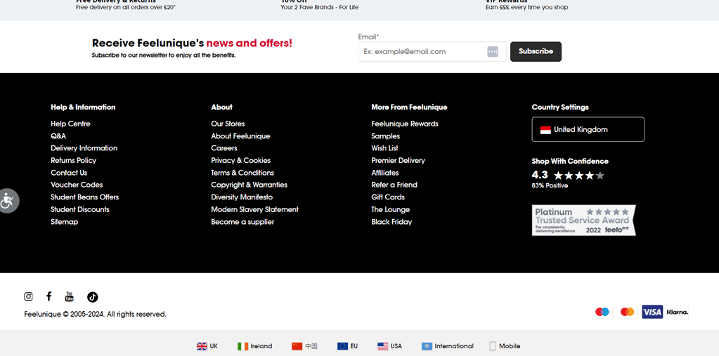
Although less prominent than the header, the footer can be an appropriate alternative location for the language button in certain situations. Suppose the header area is already crowded with other important elements. In that case, the footer can be used as a place for the language button to avoid clutter in the main navigation.
Additionally, for websites with primarily linear content flow, where visitors tend to scroll to the bottom of the page, placing the language button in the footer ensures that this option remains visible and accessible after reading the entire content. The footer can also be a suitable choice if the language button is a secondary or additional option while the main button is in the header or navigation menu.
The Feel Unique site places its language button in the footer complete with a flag icon and the name of the country.
Sidebar
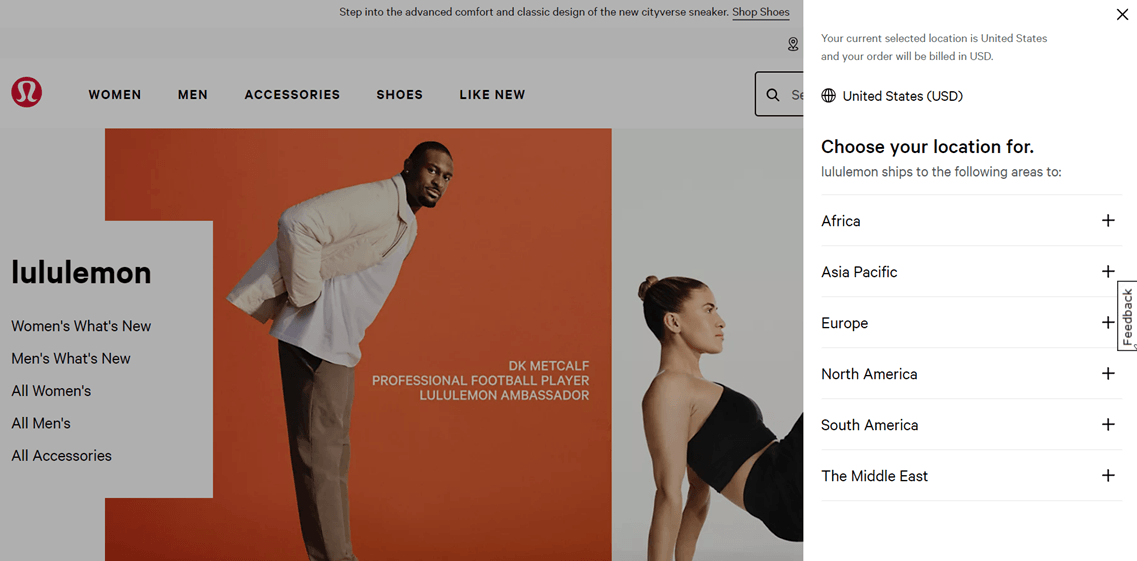
Websites with sidebar layouts can use that area to place the language button. By being in the sidebar, the language button will always be visible during the user browsing experience because the sidebar generally remains visible permanently on the page. This ensures ease of access for users whenever needed.
Placement in the sidebar can also be a good solution if the header or navigation menu is already filled with other important elements, so adding the language button in that area would only create clutter. For websites with a lot of content or functionality in the central area, the sidebar can be an ideal location for the language button, keeping the button visible yet easily accessible without obstructing the main content area.
Below is an example of the Lulu Lemon site with language buttons in the sidebar menu on the right.
Floating button or sticky element
The last option is a floating or sticky language button, especially for mobile devices or websites with minimalist designs. On small screens like mobile devices, floating or sticky buttons are more visible and accessible than placed in the header or footer, which may be hidden or require additional scrolling.
However, this approach should be implemented carefully to avoid disrupting the content display or creating an uncomfortable user experience. The button’s placement, size, and style should be considered to ensure smooth integration with the overall website design.
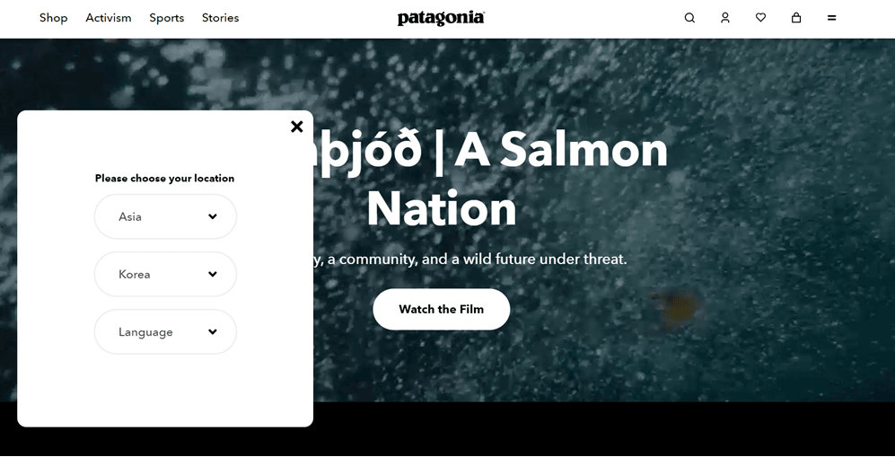
As below there is a Patagonia site with language buttons that use sticky elements. You can find the button in the lower right corner after which a box display appears as follows to select the country and language.
How do you design your Squarespace language button?
Up to this point, you already understand how important the language button is for a multilingual Squarespace website and recommendations for the position of the language button. Therefore, finding a translation service that provides easy customization options for the language button is important.
Although translation services typically provide language switchers, not all offer easily customizable and flexible options with various adjustments. However, the Linguise translation service is a solution for those seeking a user-friendly and easily adaptable Squarespace language button.
Don’t worry because Linguise doesn’t impose such limitations. It is an automatic translation service that offers user customization on the language button. Here are some other benefits you’ll get by using Linguise in creating a Squarespace language button:
- Linguise is integrated with over 40 CMS and web builder platforms, including Squarespace web builder.
- Translations into various languages are done automatically within seconds after you add them to the language button on your website.
- There are over 80+ languages that can be added to the language button.
- Linguise automatically creates unique URLs according to the target language of translation. Including hreflang codes, for example, linguise.com/fr/ for pages translated into French.
- It automatically generates canonical URLs to help avoid duplicate content on search engines when you have language variations on pages. This is one of the factors in multilingual SEO.
- You can customize the language button according to your website’s needs, ranging from icons and colors to language name displays.
- You can view the page statistics per language for each language added to the language button.
Without further ado, here are the steps to design your Squarespace language button with Linguise in a few stages.
Step 1: Register your Linguise account
To design a language switch button for your Squarespace website using Linguise, the first step is registering an account on the Linguise platform. You can sign up for free and use a one-month free trial, which allows you to access various features available in this service.
Step 2: Add your Squarespace domain site
The next step is to add the website domain to the Linguise dashboard. Some data needs to be entered, including account information, URL, platform selection (Squarespace), native language, language to be translated, and translation URL settings.
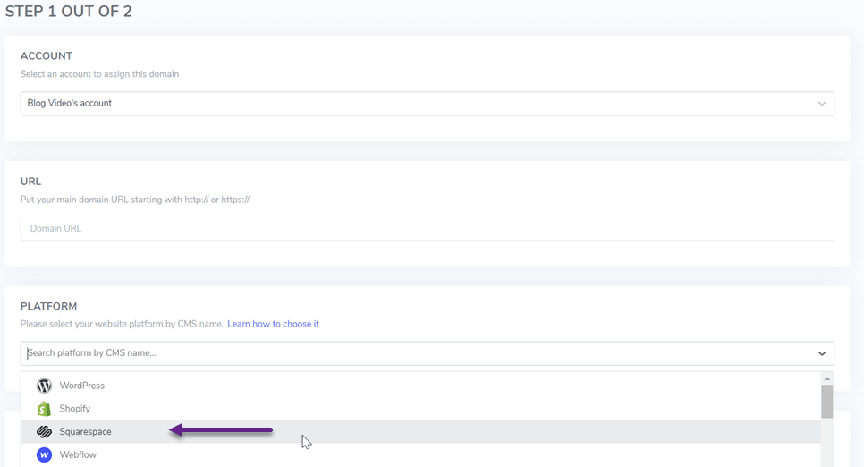
You can see the install automatic translation Linguise in Squarespace for complete steps to add a domain.
Step 3: Integrate the language button on Squarespace
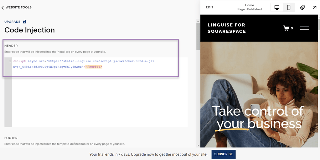
The next step is to integrate Linguise into your Squarespace website by adding the script code provided to the dashboard like this.

Afterward, access the Squarespace dashboard, choose the desired website you wish to make multilingual, navigate downwards, and opt for Website Tools.
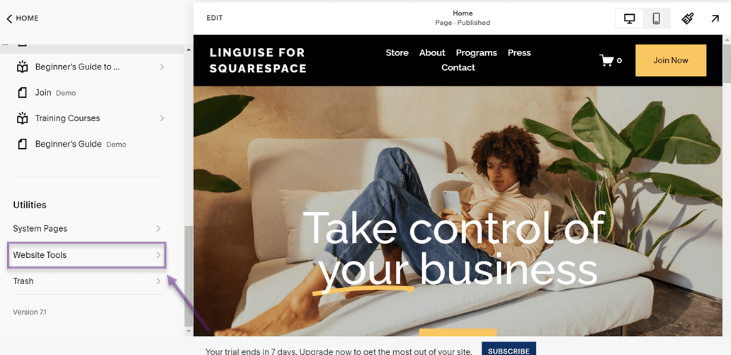
Next, within the Website Tools menu, choose the option for Code Injection.
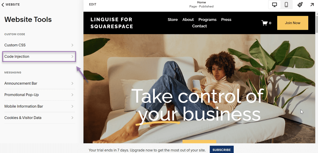
Then, after that, there are the HEADER and FOOTER sections. If you want the language button in the header, put the code in the HEADER column. Likewise, if you put it in the footer, enter the code in the FOOTER column.
Step 4: Setup language flags display Squarespace
After integrating Linguise and Squarespace, Linguise will automatically create the language button on the Squarespace website. However, the appearance is still the default.
Therefore, you can customize the design of the language button in a few steps.
Ensure you are logged into the Linguise dashboard and then select Settings > Language flags display. After that, several sections will appear, the first of which is as follows.
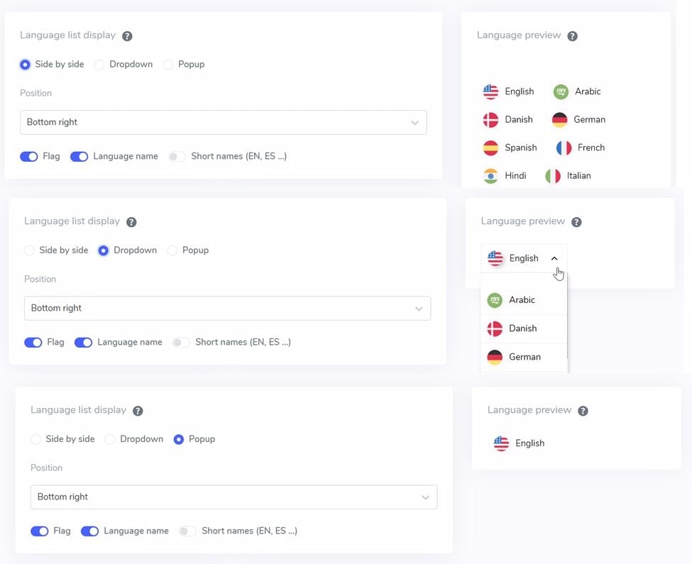
In this section, there are several settings:
- List display
- Position
- Language preview

The list display options have 3 options, side-by-side, dropdown, and popup. Below is a preview of the three options.
Then, for the position of the language button itself, Linguise offers several positions you can choose from.
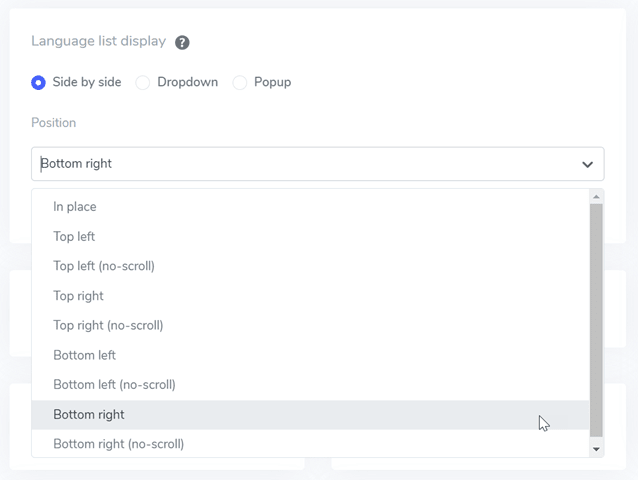
Next is positioning adjustment, where you can choose where the language switcher will be placed. You have a variety of position options to select from. Ensure you choose a position that is easily accessible to visitors.
Finally, select the combination of flag + language name, flag + short name, or flag only.
Step 5: Set flags design on the language button
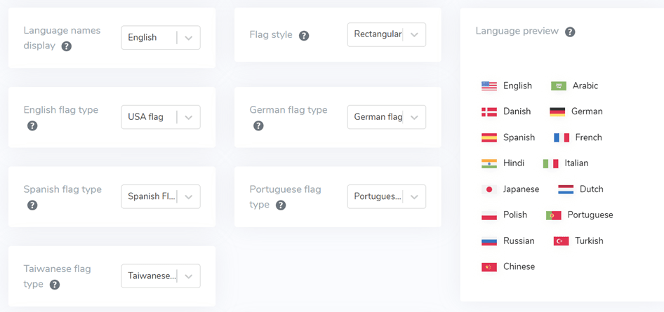
Below the main interface, there are flag design settings. Several setting options are visible in the image below.
- Language names display: You can choose to display the name based on the country or the language, for example, “Germany” or “German.”
- English flag types: This option is used for languages that have more than one type, such as “English USA” or “English Britain” (similar to Spanish, Taiwanese, German, and Portuguese).
- Flag style: Used to determine the shape of the flag icon, whether circular or square (rectangular).
Step 6: Customize the color and size flag
After configuring the flag design, the next step is adjusting colors, sizes, and various other elements. In the following display, there are several customizable settings, such as:
- Flag border-radius: Adjusts the border radius in pixels when using rectangles.
- Language name color: Select the default text color for language names.
- Popup language color: Color of the language title in the popup or dropdown area.
- Flag size: Adjust the size of the flags.
- Hover language name color: Text color when hovering the mouse over language names.
- Hover popup language color: Text when the mouse hovers over the language title in the popup or dropdown.
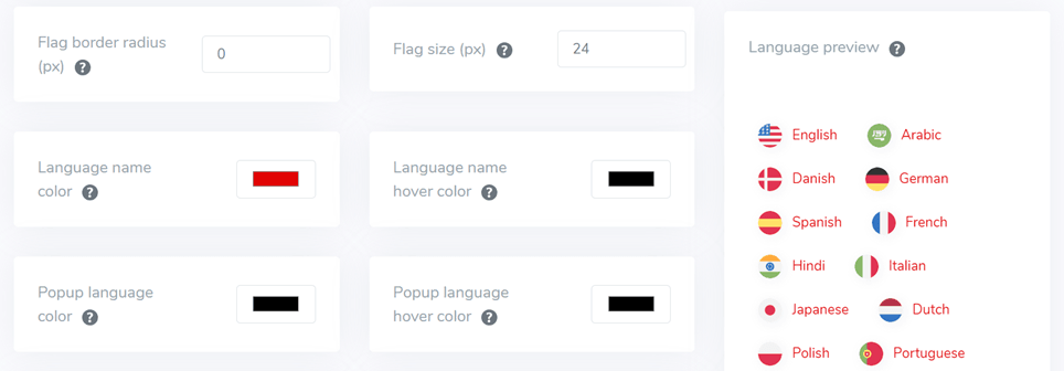
Step 7: Adjust the flag box shadow button
In the final stage, you can configure the shadow settings for the flags. The first setting allows you to specify shadows for each flag on your website, and the subsequent setting is for the shadows on language flags when hovered over.
If you’re satisfied, don’t forget to select Save to preserve your language switcher customizations.
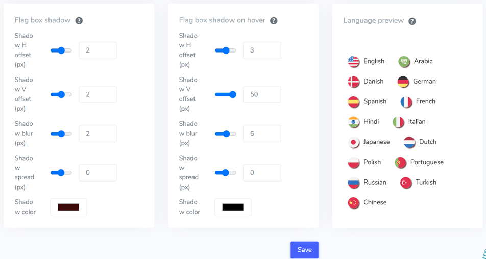
You can use These Squarespace language switch button design features in Linguise. You can adjust the settings above to suit your website needs.
Below is an example of what a Squarespace website looks like with customized design language buttons.
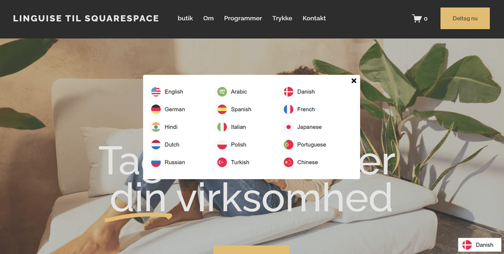
How easy, right? Some may wonder where the right Squarespace language button is located so users can easily reach it. We will discuss this further.
Tips for designing Squarespace language switch button
Now that you know how to create the Squarespace language button, next is to perfect it by implementing the following tips:
- Strategic placement – Determine a location to place the language switch button on your Squarespace site. Place the button in an area easily found by visitors, such as the header, navigation menu, footer, or sidebar. Consider the visitor’s flow when browsing your site and ensure the button remains visible and easily accessible on all site pages.
- Appropriate style selection – Choose a style for the setup language switcher that fits your site’s character and overall design. You can use text, flag, or global icons to represent language options. Customize the button style to match your site’s branding for consistency and visual appeal. Also, select a recognizable and universal style so visitors can quickly identify and use the button.
- Clear naming – Ensure the language names displayed on the language switch button are clear and easily understood by visitors. Avoid using abbreviations or codes that may confuse users. Use language names commonly understood by the majority of your site’s users. Additionally, consider providing alternative text or tooltips that provide additional information about each language to enhance user understanding.
- Smooth transition – Implement smooth language transitions without reloading the entire page. You can use technologies like AJAX or JavaScript to create seamless transitions between languages without disrupting the user experience. Also, provide visual cues to users during the language transition process, such as animations or clear notification messages.
- Mobile responsiveness – Design the language switch button to be responsive and adaptable in size and appearance for various mobile devices. Consider a compact approach or using responsive icons to ensure the button remains easy to access and use even on smaller screens. Ensure the button remains visible and functions appropriately on various devices and screen sizes.
- Consistency across pages – Maintain consistency in the style, placement, and functionality of the language switch button across your site. This will help create a smoother and more cohesive user experience when navigating between site pages. Ensure the language switch button has a consistent appearance and behavior on all site pages to avoid user confusion.
- Testing and refinement – Conduct thorough testing of the language switch button across various devices, browsers, and user scenarios. This includes testing language transition functionality, button responsiveness, and language naming clarity. Use feedback from user testing to make adjustments and refine the button design and functionality to meet user needs and preferences.
Design your Squarespace language button using Linguise from now!
Now that you understand why the language button is important for the multilingual Squarespace website, how to design the Squarespace language button, and tips for creating it.
By correctly designing the language switch button, you can significantly enhance the user experience of your Squarespace website. This will have various impacts, as explained earlier.
So, why wait any longer? Sign up for Linguise, register your Squarespace website, and customize the language switch button configuration to provide a better user experience.

