Did you know that 3 out of 4 online buyers prefer to buy products with information in their native language? (Source). Having a multilingual website has its own benefits, such as:
- Offer a personalized user experience.
- Boost sales due to localized information.
- Reach a larger audience without geographical limitations.
- Improve brand image by showing yourself as a global company.
- See an increase in conversions and reduced bounce rates.
But a lot of businesses do not know how to create multilingual websites the right way!
That’s why here are 18 practical UX tips we recommend you keep in mind when designing your multi-lingual website.
18 UX Tips for a Multilingual Website
When designing a multilingual website, it is essential to consider various factors to ensure a seamless user experience across different languages and cultures. Here are the 18 best UX tips for multilingual websites.

Planning and Structure
Before you start designing your multilingual website, you need to plan and determine a few things.
1. Identify Target Languages
To choose the best languages for your multilingual website, start by analyzing your audience’s location and demographics. Look at your current website traffic and customer data to see which languages and locations are most common.
Research the languages spoken in your target markets using census data, market reports, and competitor analysis.
For example, according to the United States Census Bureau, Spanish is the second-most spoken language in the United States. So, if US customers are your target audience, it makes a lot of sense to have a Spanish version of your website along with an English version.
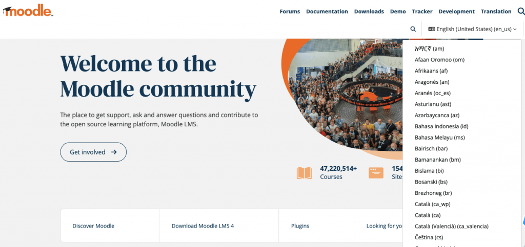
Start with the most widely spoken languages and expand as your website grows. By analyzing your audience data and aligning language choices with your business goals, you can select the most relevant languages for your multilingual website.
2. Use a Clear URL Structure
A clear URL structure is crucial for a multilingual website. It improves SEO, as search engines can easily index and rank different language versions of your site, boosting visibility in local searches.
The subdirectory structure is the most common and recommended method. Each language gets its own subdirectory under the main domain, like www.example.com/en/ for English, www.example.com/es/ for Spanish, and www.example.com/fr/ for French.
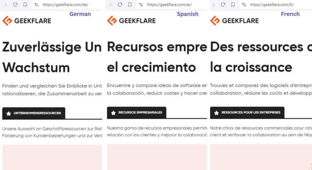
Choose a structure you can consistently maintain across your website. Avoid mixing different structures. Use ISO 639-1 language codes (like “en” for English and “es” for Spanish) to ensure clarity and standardization.
Use canonical tags to indicate the preferred version of a page to search engines, especially if you have similar content across languages. Implement hreflang tags in your HTML to help search engines understand your pages’ language and regional targeting.
3. Use Global Templates
When a website visitor chooses a different language, they must not land on a completely different website. Use the same website template for all of your translated web pages.
Here’s an example of Canva. When the website is translated into Spanish from English, the space between the headings and paragraphs, the button placement, the menu and icons, the pricing plan format, and everything else remain the same.
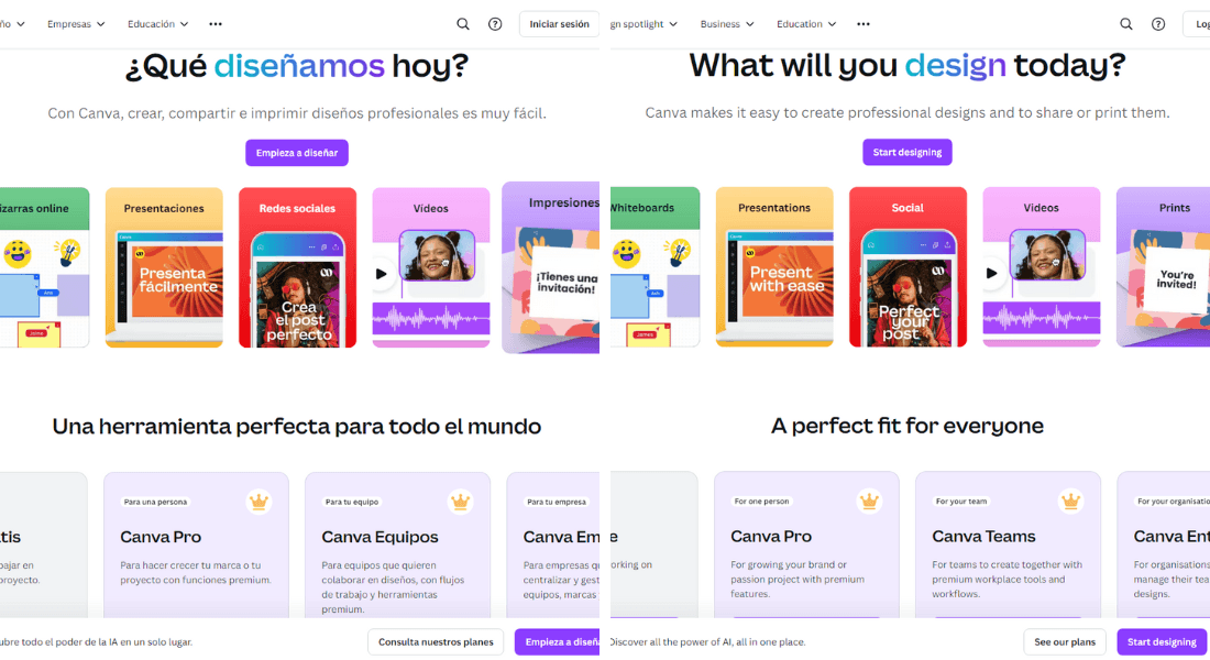
A global template helps with consistent branding and provides a seamless user experience, no matter which language they switch to. Ensure your users see the same layout, design elements, branding, and colors when switching from the default language.
If you are using a Content Management System (CMS), such as WordPress, with Linguise, creating a branded multilingual website is a cakewalk. Linguise deeply integrates with your website’s theme and auto-translates your content without additional database requests or excess server load. This way, your website performance is not compromised.
If you use an eCommerce plugin like WooCommerce, Linguise auto-updates the main page and translated pages with each product update.
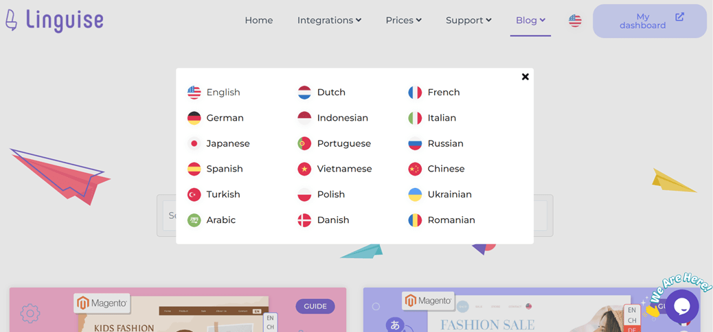
4. Consider Spacing for Text Expansion
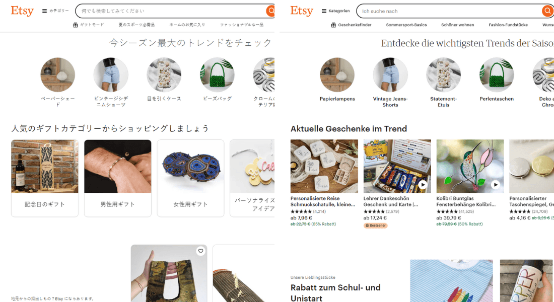
One of the most crucial UX tips when designing a multilingual website is to account for text expansion. Each language has different writing styles and word lengths which need to be taken into account.
Look at this example of Etsy. On the left, you can see the website content in Japanese, and on the right, you can see the same content in German.
Some languages will take more space, while some will take less. Your website layout must be able to adapt spacing to ensure the translated content remains legible.
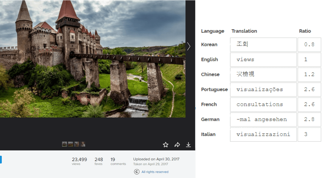
Here’s a demonstration of how a text expands or contracts in different languages. According to W3C, the word “view” has a 300% expansion from English to Italian!
Also consider line height and character style. Some languages have taller characters than others, while some scripts need more spacing than other scripts.
For example, Arabic script needs more vertical space between lines than Latin.
5. Keep Content Separate From Design
Keep text separate from multimedia elements for easier updates and translations.
Keep textual content within HTML elements like <p>, <h1>, and <span>. Use CSS for styling to ensure design changes don’t affect the content. Store text strings in separate language files like JSON, XML, or PHP.
This allows easy updates and translations without touching the main codebase. Use localization libraries like i18next for JavaScript to manage translations dynamically.

Keep design and content separate and the layout is less likely to get messed up after translation.
6. Provide Language Switch Options
Providing clear and accessible language switch options is essential for a multilingual website. Place the switcher in the top right corner for easy access, and use contrasting colors and clear typography to make it stand out. For clarity, include the language name in the native script (e.g., “Español” for Spanish).
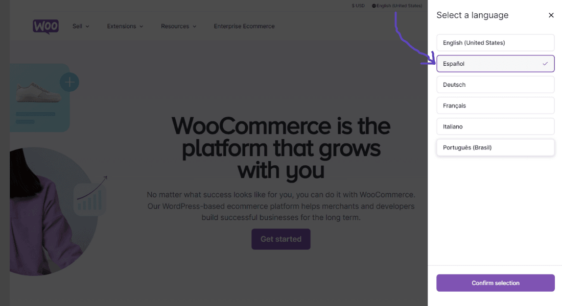
A dropdown menu can efficiently display multiple language options without taking up too much space. Using flags can provide a visual cue but be cautious, as flags can sometimes be misleading.
For example, a flag may represent a language spoken in multiple countries. It’s often best to combine flags with language names for clarity.

Clearly show the selected language using a different color or bold font. Using techniques like AJAX, ensure that selecting a language immediately changes the content without refreshing the page. Make the language switcher responsive for mobile devices and test its usability with native speakers.
Content and Translation
Here are a few tips related to content and translation for a better user experience.
7. Avoid Idioms and Slang
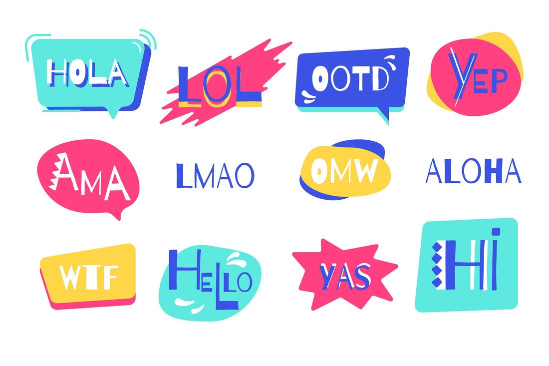
Not all slang is universally acceptable. In fact, some slang is considered acceptable in some countries and wildly offensive in others. You should always use clear and straightforward language that translates well across cultures.
For example, here’s a popular Russian idiom – Хоть кол на голове теши. This idiom, in Russian, means “He’s a very stubborn person.”
However, the literal translation of the idiom comes out to be, “You can sharpen with an ax on top of this head.” 😂
Here’s another example of how a common English word can be disastrous if auto-translated with moderation. The English word Salsa sounds like 설사 (seolsa) in Korean, meaning “diarrhea”.
That’s why we recommend avoiding slang or idioms only relevant to a particular culture or demographic. Instead, use simple language that can be easily translated into other languages.
8. Use Culturally Appropriate Images and Icons
Adapt content, images, icons, and other multimedia to reflect local customs and cultural references.
For example, Clarins, a skincare brand that caters to a global audience, shows Caucasian women in its European website versions.
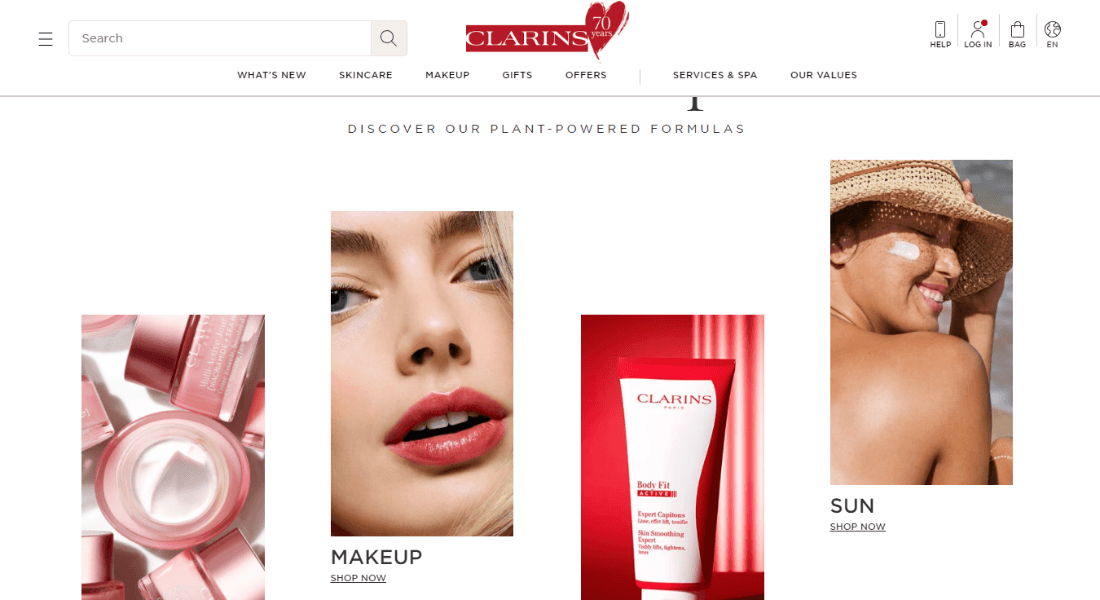
However, on the Japanese version of its website, they show Japanese women to better connect with local customers.

For icons, especially the language switcher icon, use a globe icon that looks universal. For example, in the image below, the first icon might appeal to South and North American audiences but not to African and Asian audiences.
The second icon might appeal to the African audience but not others.

To avoid this confusion, go with the universal globe icon that appeals to everyone – the third one. It doesn’t highlight a specific region or country and is more appropriate for a multilingual website.
9. Offer Subtitles for Multimedia
For multimedia, use subtitle files for video translations without altering the video. Ensure images and multimedia elements have descriptive alt text that can be translated separately from the visual content.
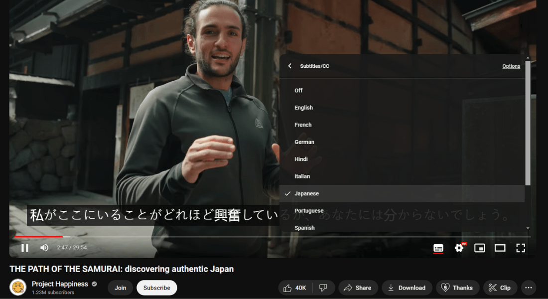
Here’s another example of how translation can help you reach a wider audience. We are avid viewers of Project Happiness, a YouTube channel run by an Italian traveler named Giuseppe.
The creator is Italian. He records in Italian and dubs his videos in English, but his channel is viewed all over the world because of the wide variety of subtitles he provides.
10. Regularly Update Translations
Linguise allows you to edit your translated pages on the front-end with a user-friendly interface. You can assess the translations yourself and make changes if you feel the need.
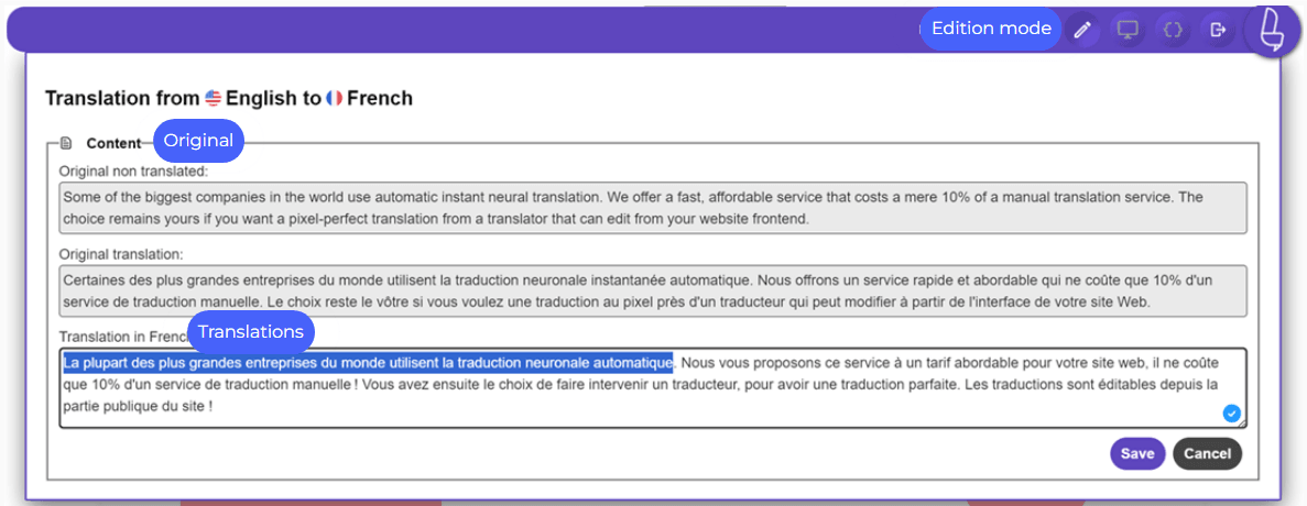
ECommerce websites have a lot of frequent changes—products go out of stock, limited-time sales, changes in product information, and more.
But, using Linguise makes updating translated content easy. Its dedicated translation server and cache system speed up the translation process and display the translated page to your audience.
11. Consider Right-to-Left Languages
Most languages are written from left to right. However, some, like Arabic, Hebrew, and Persian, are written from right to left.
Here’s a comparison of the English and Arabic versions of the Instagram homepage. As you can see, the Arabic version has flipped everything from right to left, the images, the buttons, the text, and even the search bar.
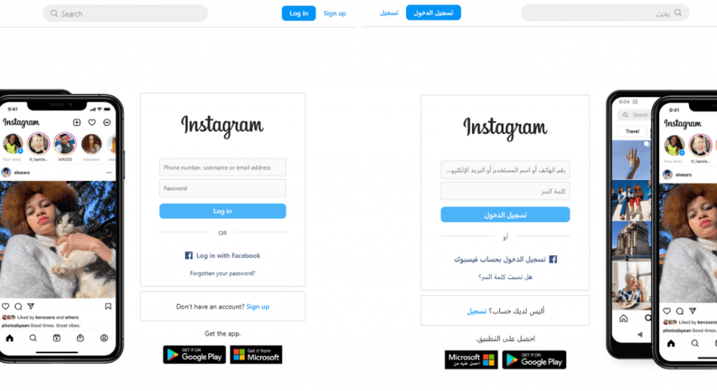
Linguise’s translation service supports right-to-left languages natively and can adapt the layout of your multilingual site to accommodate them.
Here are some of the available right-to-left languages:
- Arabic (ar)
- Hebrew (he)
- Persian (fa)
- Pashto (ps)
- Urdu (ur)
If you want to include these languages, use a website layout that can accommodate such major changes.
SEO and Performance
We strongly recommend optimizing your multilingual website for international search engines to maximize its impact.
Conduct keyword research in each target language, use hreflang tags for language and regional targeting, and monitor performance.
12. Optimize for Local SEO
Start with localized keyword research for each language and region. Use tools like Google Keyword Planner, SEMrush, or Ahrefs to find relevant keywords your target audience is searching for.
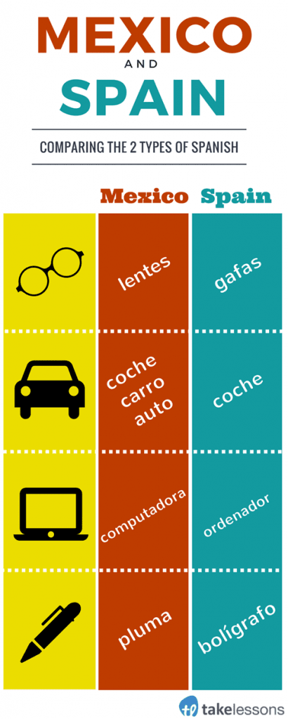
Consider regional dialects and variations in terminology. For instance, Spanish in Mexico differs from Spanish in Europe, so tailor your keywords accordingly.
Create unique title tags for each language version of your pages, incorporating localized keywords. Keep them concise and relevant, ideally under 60 characters.
For example, in English: “Buy Organic Coffee Online | Best Prices” and in Spanish: “Compra Café Orgánico en Línea | Mejores Precios.”
Write compelling meta descriptions for each language version, including localized keywords and a clear call to action, keeping them under 160 characters.
For example, in English: “Shop our selection of organic coffee, sourced from the best farms. Free shipping on orders over $50!” and in Spanish: “Compra nuestra selección de café orgánico, proveniente de las mejores fincas. ¡Envío gratis en pedidos superiores a $50!”
13. Utilize hreflang Tags
Use hreflang attributes in your HTML to inform search engines about the language and regional targeting of your pages. This helps prevent duplicate content issues and ensures users are directed to the correct language version.
14. Monitor Performance Across Languages
Monitor the performance of each language version using tools like Google Analytics and Google Search Console. Analyze traffic sources, user behavior, and keyword rankings to identify areas for improvement.
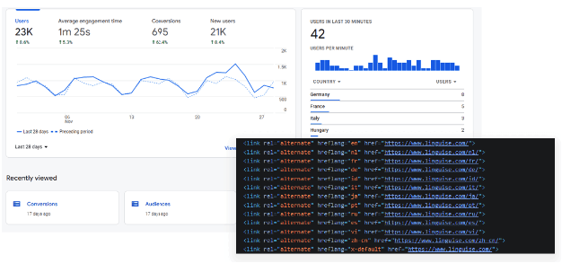
Experiment with different keywords, meta tags, and content strategies to see what resonates best with your audience in each language.
Maintenance and Support
There are also considerations to make when it comes to maintaining and supporting websites and customers.
15. Create a Maintenance Plan
Creating a comprehensive maintenance plan for your multilingual website ensures that all language versions remain consistent, accurate, and up-to-date.
A well-structured plan will help you manage content effectively, address user feedback, and adapt to changing market conditions.
Perform content audits to assess the relevance and accuracy of existing content in all languages. Check for outdated information, broken links, and inconsistencies across language versions.
Regularly test the language switcher, navigation, and other interactive elements to ensure they work correctly.
16. Provide Customer Support in Multiple Languages
Providing customer support in multiple languages enhances user experience and builds trust with a diverse audience.
Hire customer service representatives who are fluent in the languages you support. This can include full-time staff or part-time contractors.
To understand which languages to prioritize, you can analyze your website traffic and customer demographics or conduct surveys or feedback forms. Use the results to understand the language preferences of your existing customers.
17. Feedback Mechanism
Create simple, user-friendly feedback forms that allow users to report issues with translations or usability. Ensure these forms are accessible from every page, ideally in the footer or through a dedicated support section.
Ensure that feedback forms are available in all supported languages, allowing users to provide feedback in their preferred language.
Include structured questions that guide users to provide specific feedback. For example:
- Rate the accuracy of the translation (1-5 scale).
- What issues did you encounter with the translation?
- How easy was it to navigate the site in your language?
For those not interested in filling out the feedback form, implement quick feedback buttons (e.g., thumbs up/thumbs down) on translated content. This allows users to indicate easily whether the translation was helpful or accurate.
18. Use a Staging Site for Updates
Test new content and updates in a staging environment before going live to avoid disruptions. You can use an AI website builder like ZipWP to create a complete website in seconds.
The website will include all the essential pages, relevant images, engaging website copy, and embedded CMS and SEO functionalities.
Ready To Reach a Global Audience?
These 18 UX tips for multilingual websites will help customers navigate your website better and engage with content in their preferred language.
Good multilingual UX design can significantly increase user engagement and conversion potential. However, creating a multilingual website with a seamless experience takes time and effort.
This is where Linguise can help!
Linguise natively integrates with 40+ CMS, such as WordPress, Shopify, Webflow, Squarespace, and others. It supports 80+ languages and 10,000+ language pairs to provide the best multilingual website experience.
All translations are SEO-optimized and affordable, costing 10% of a manual translation service.
Are you ready to go global with Linguise?


